

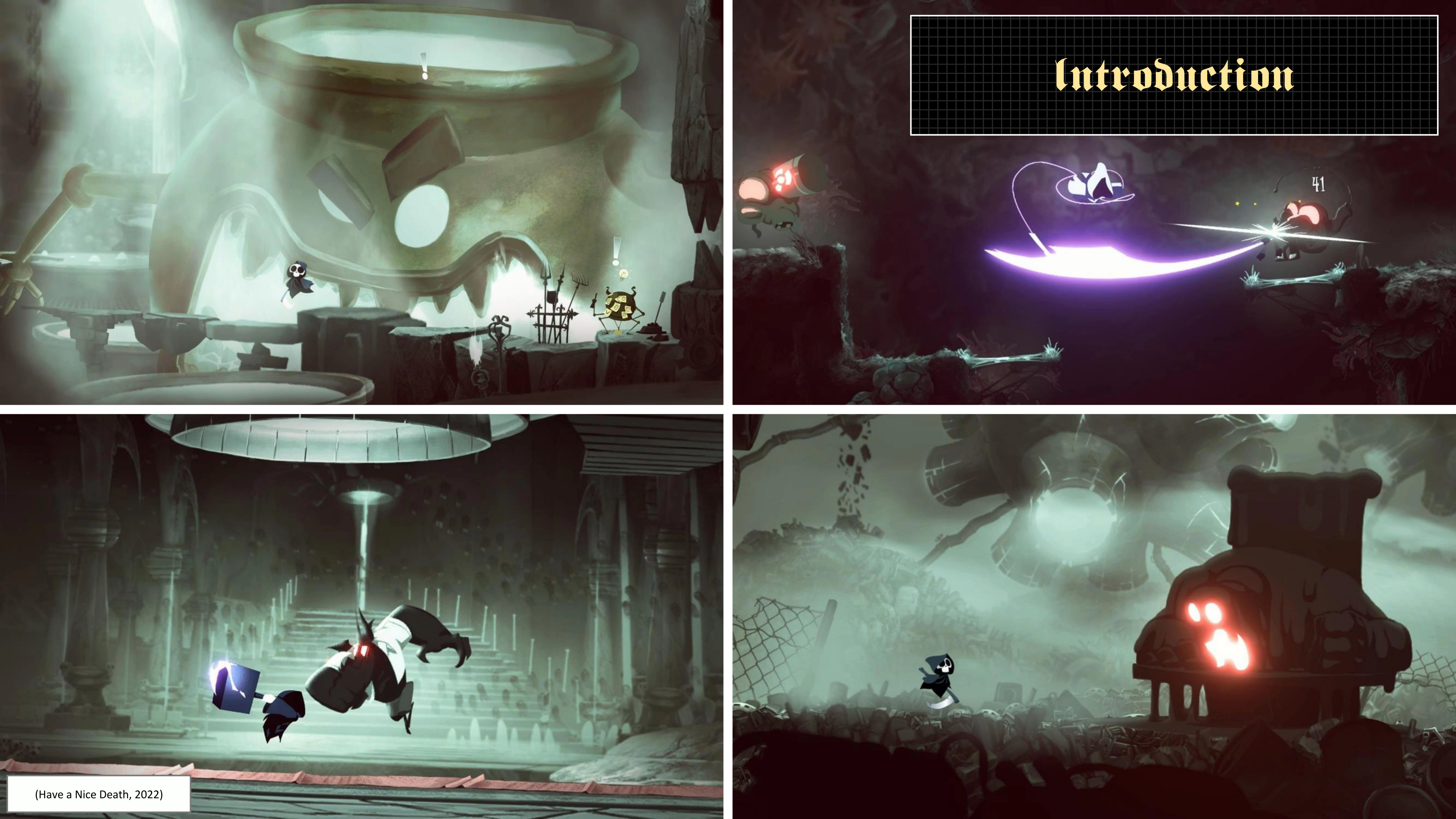
My inaugural project at SAE Institute involves replicating a game's style and implementing it on a newly crafted weapon. This project primarily emphasizes understanding weapon design, encompassing aspects such as shape, colour, and texture language. It involves utilizing Photoshop to both create and implement this acquired knowledge.
Use the design principles learned in class and structure an analysis using the following points:
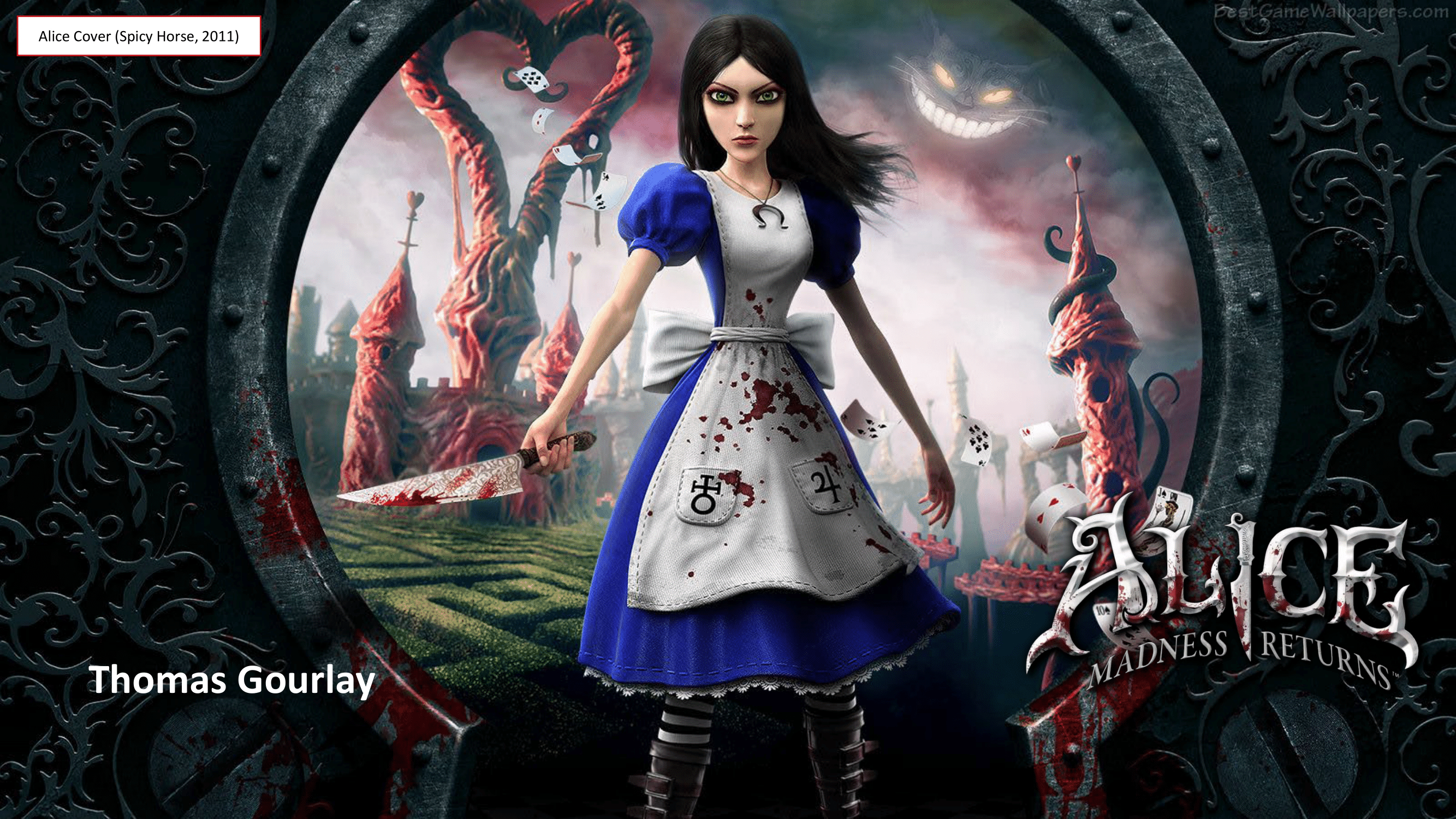
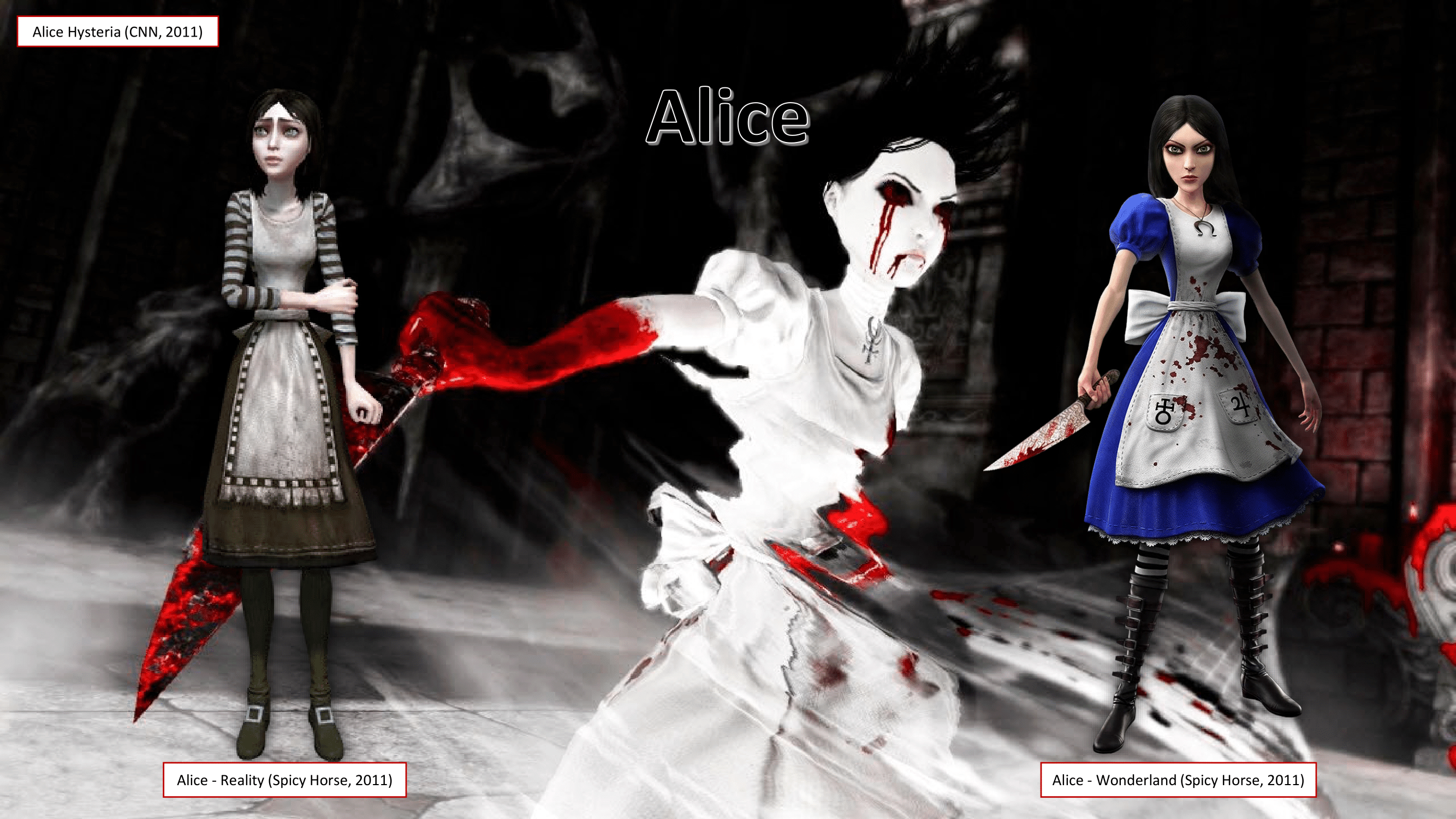
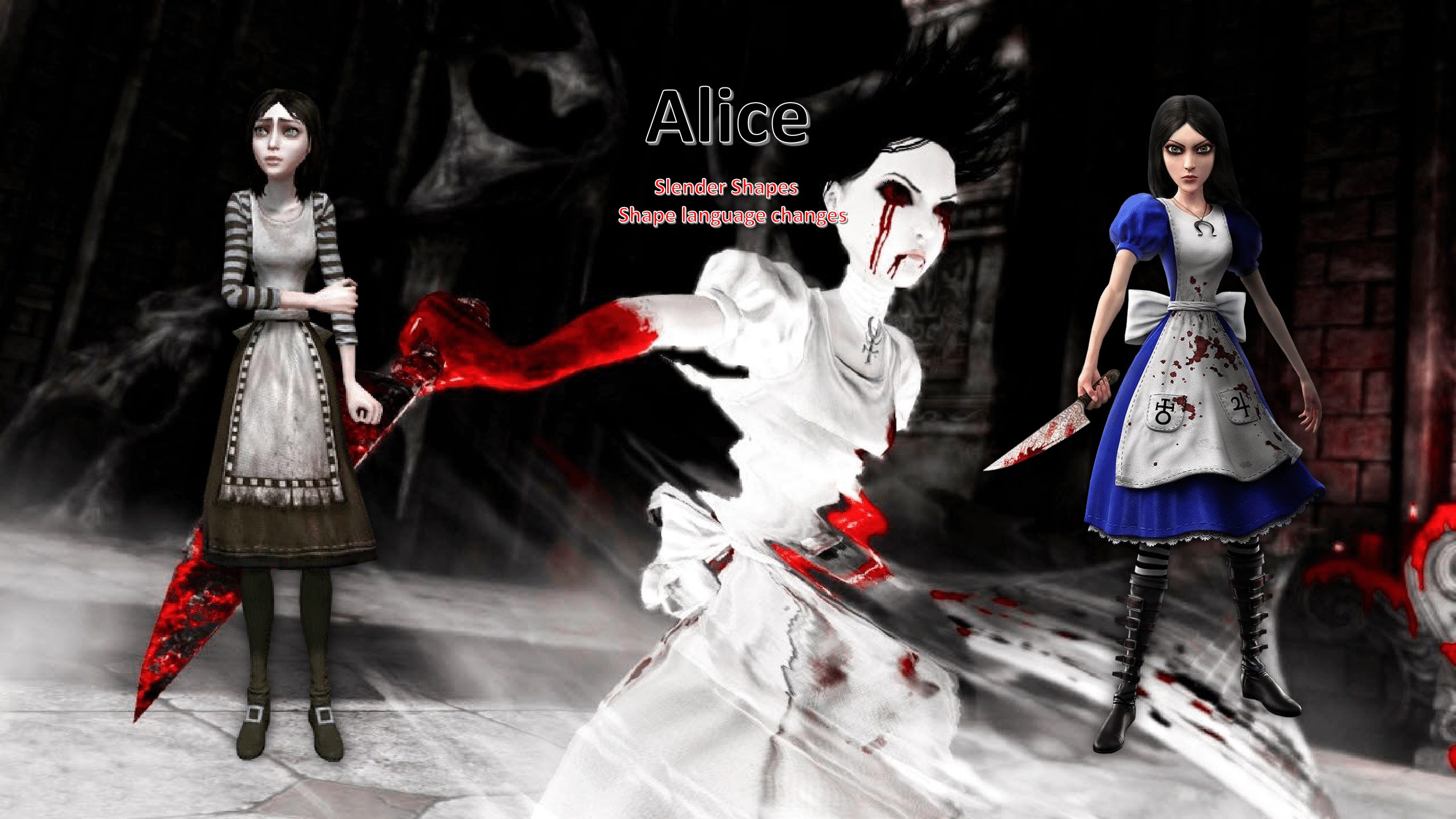
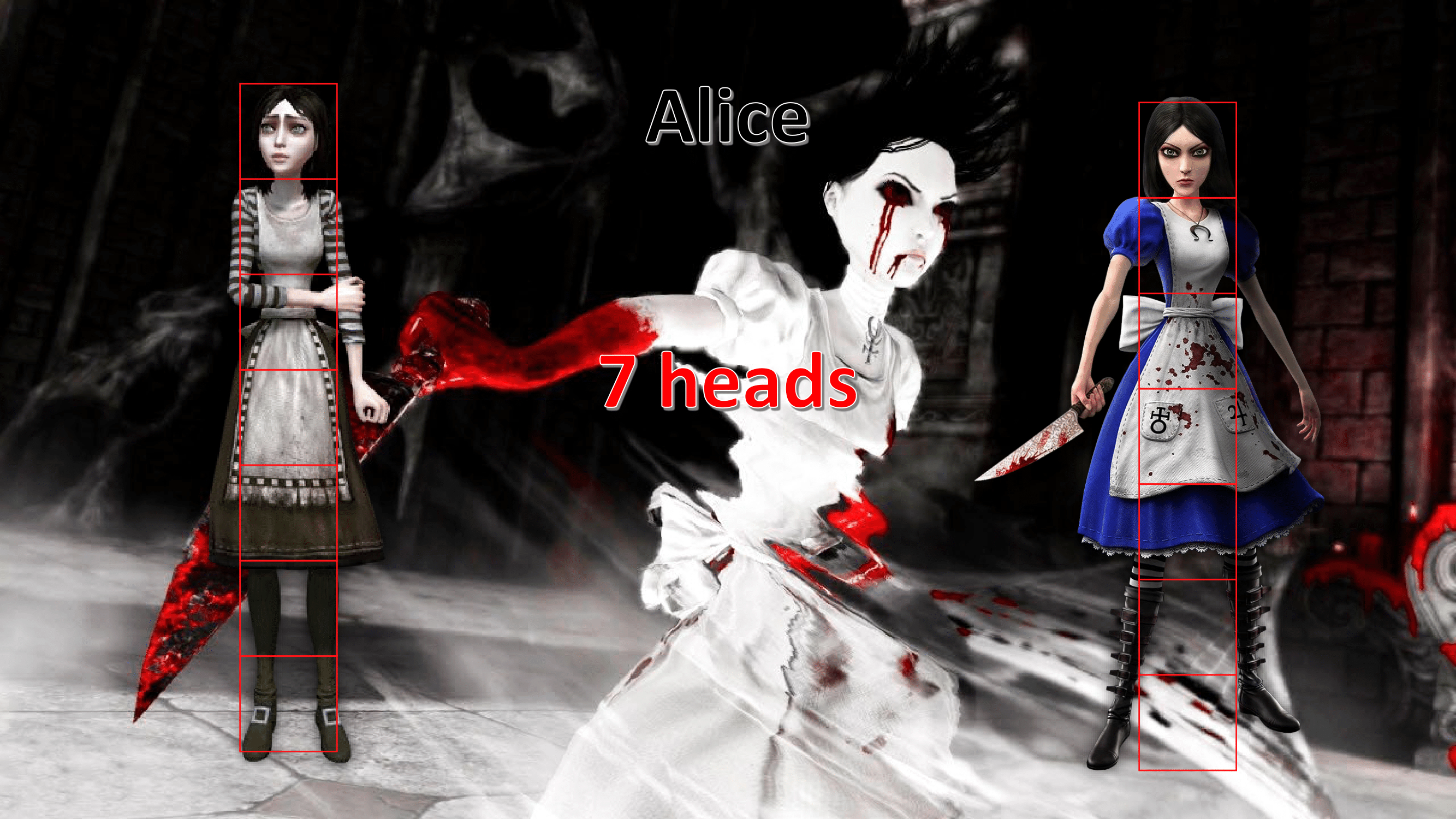
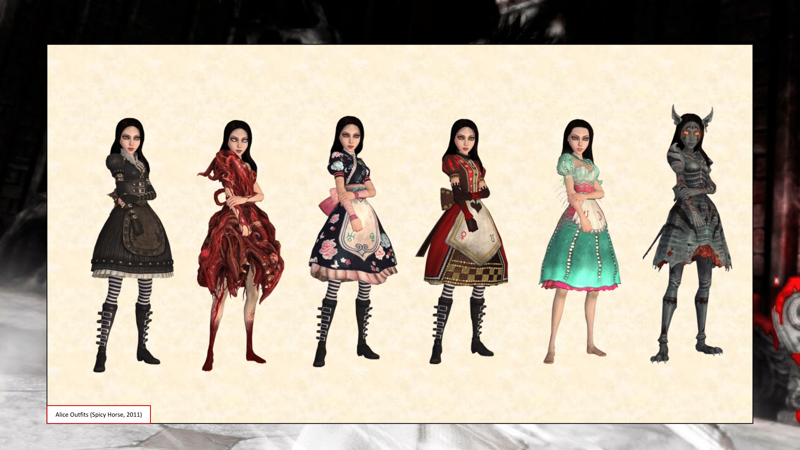
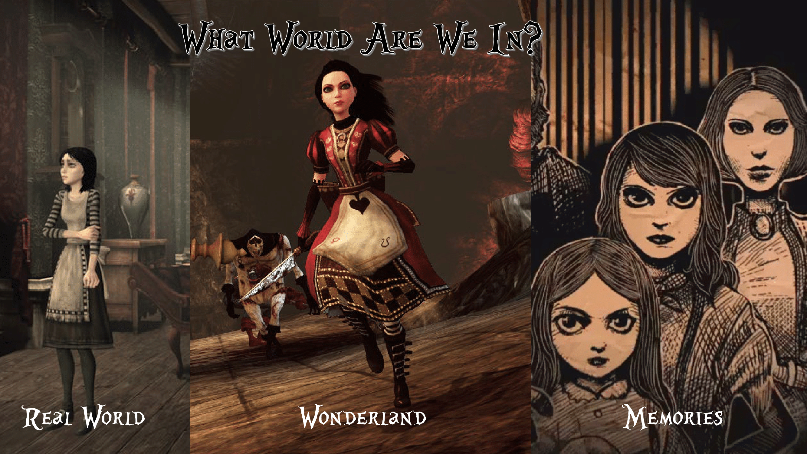
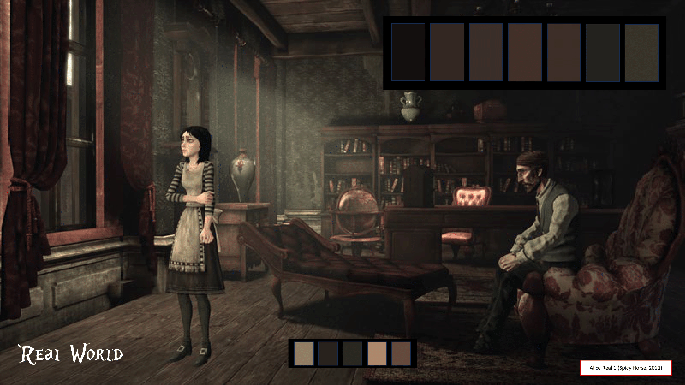
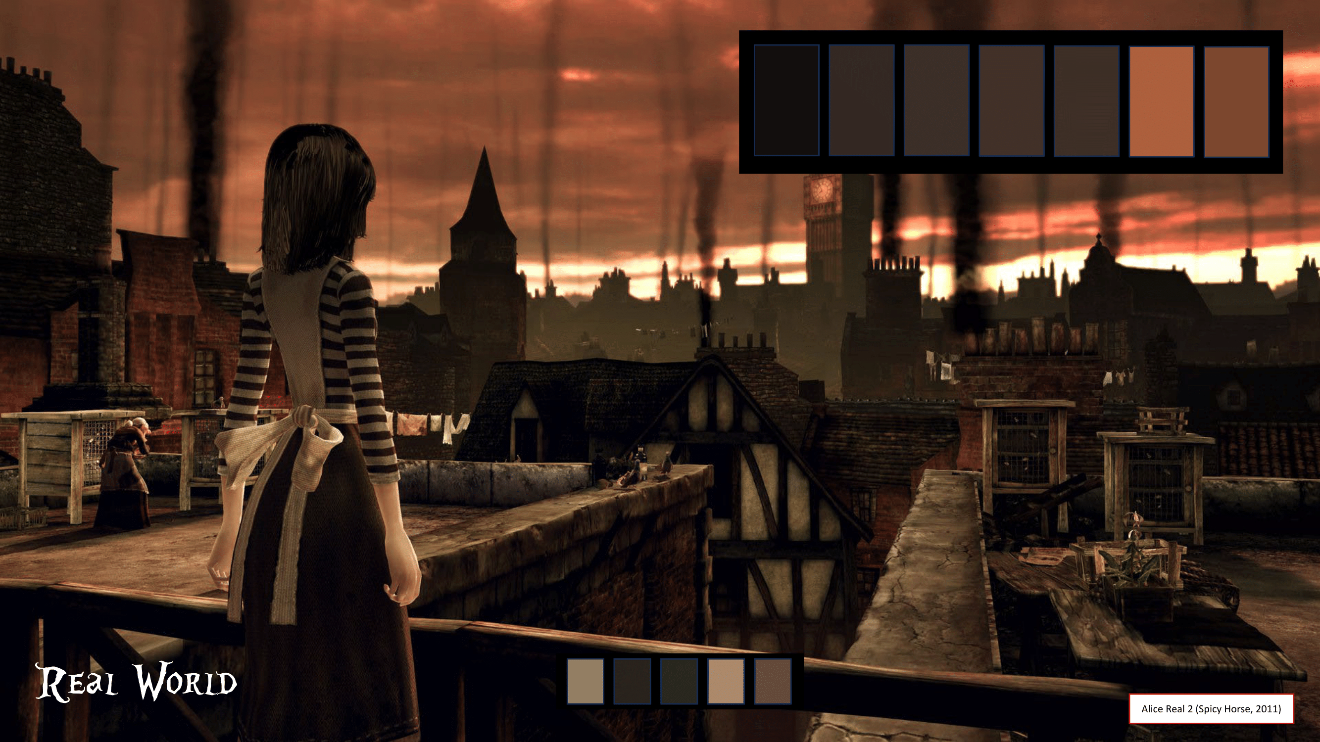
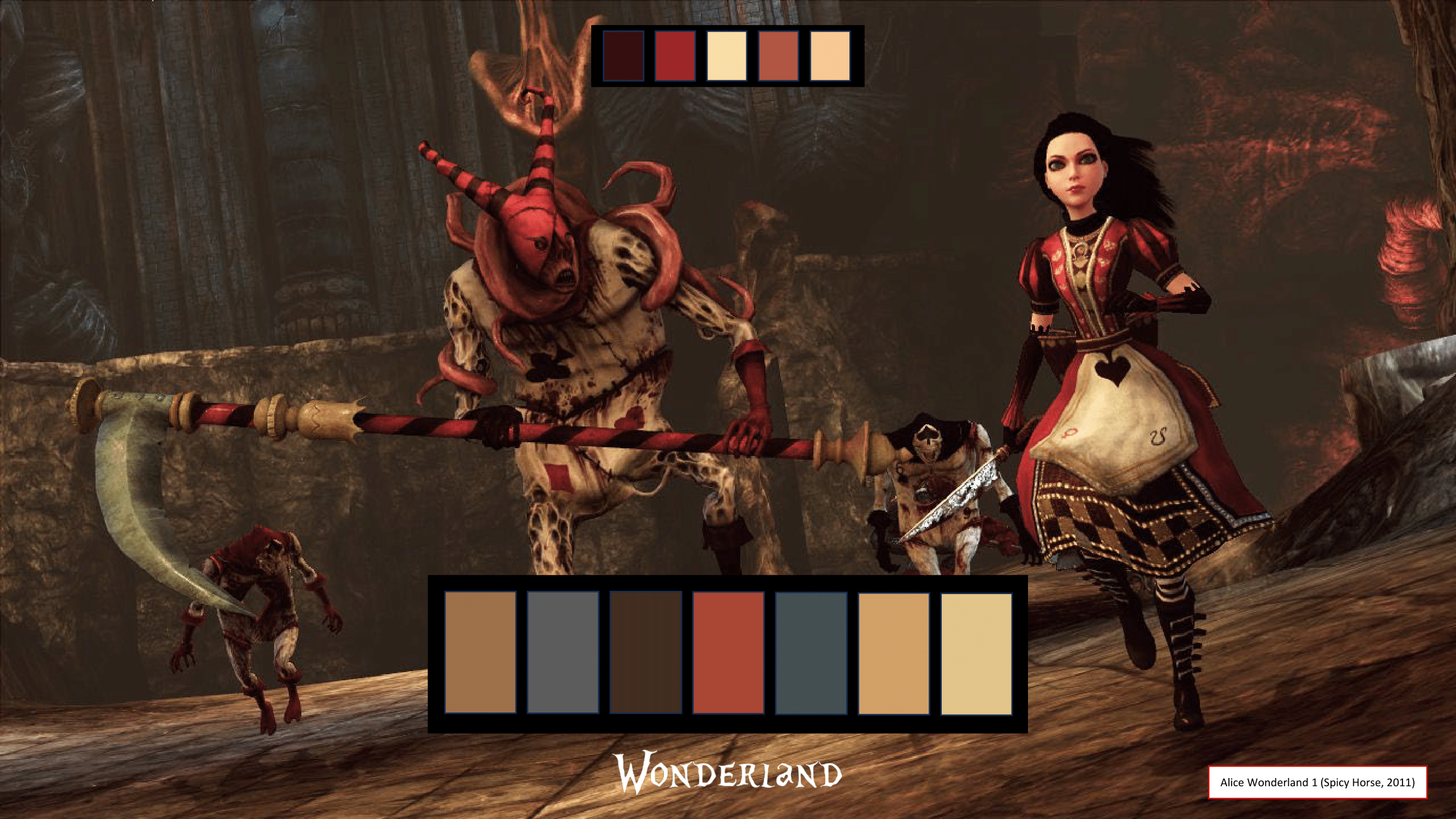
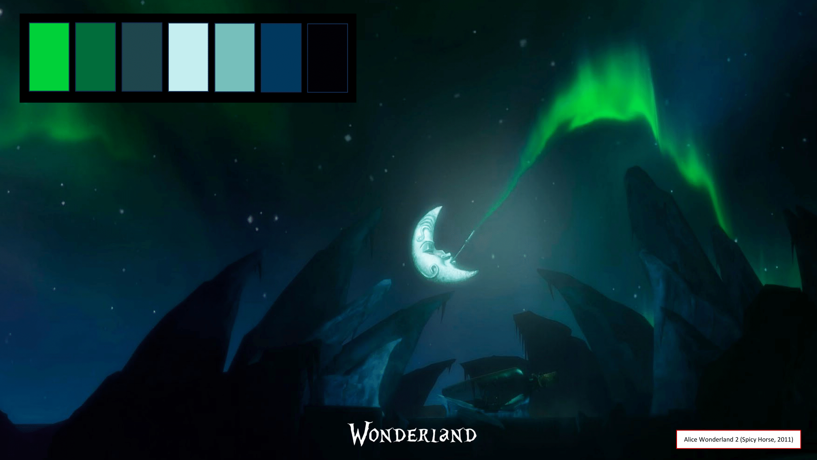
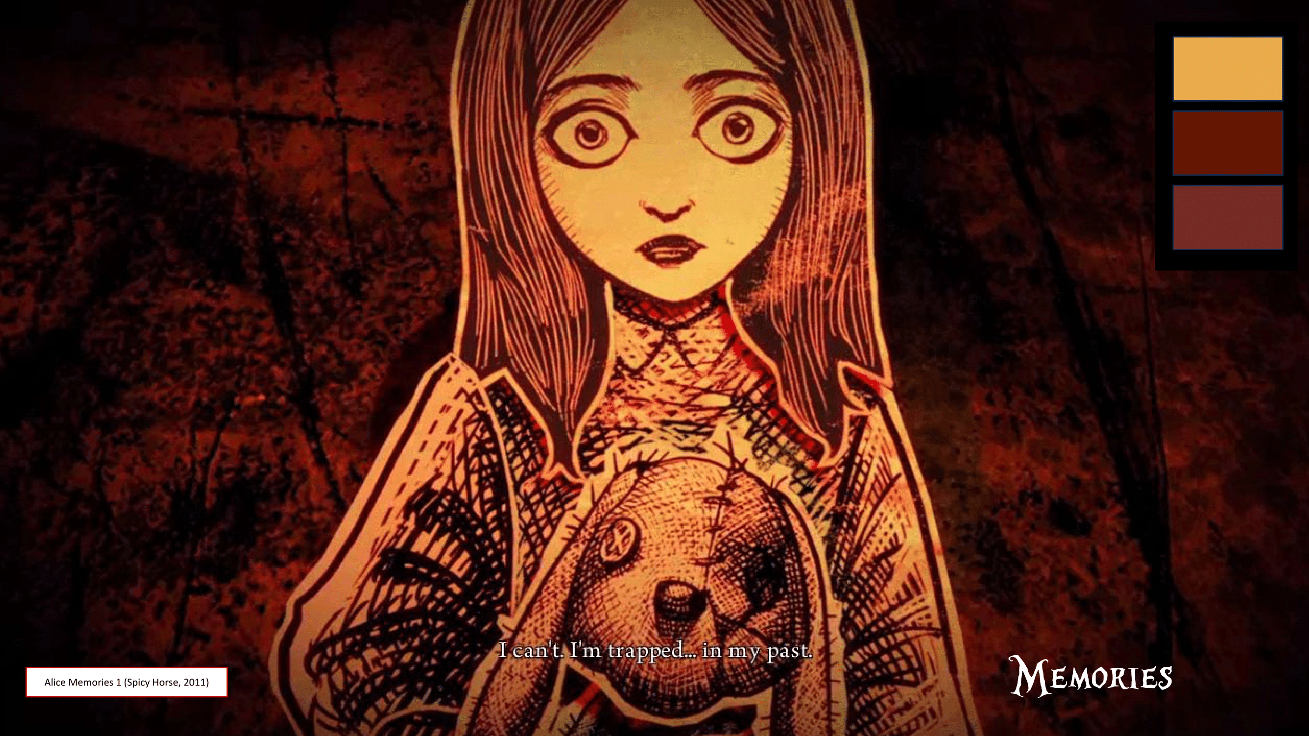
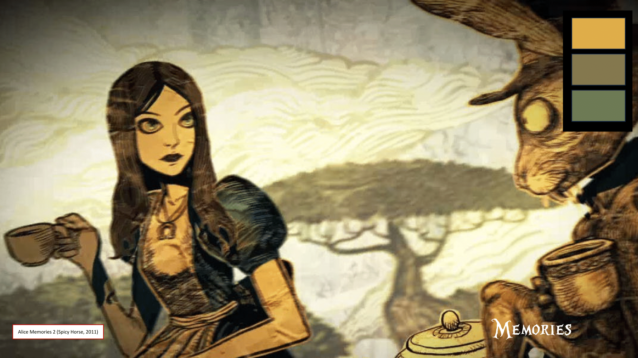
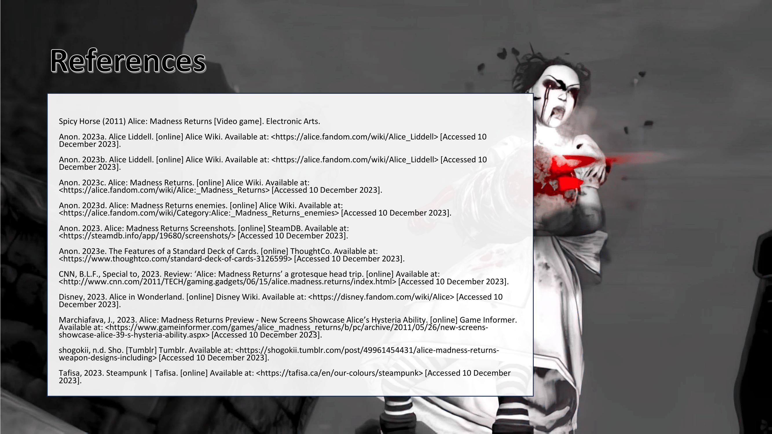
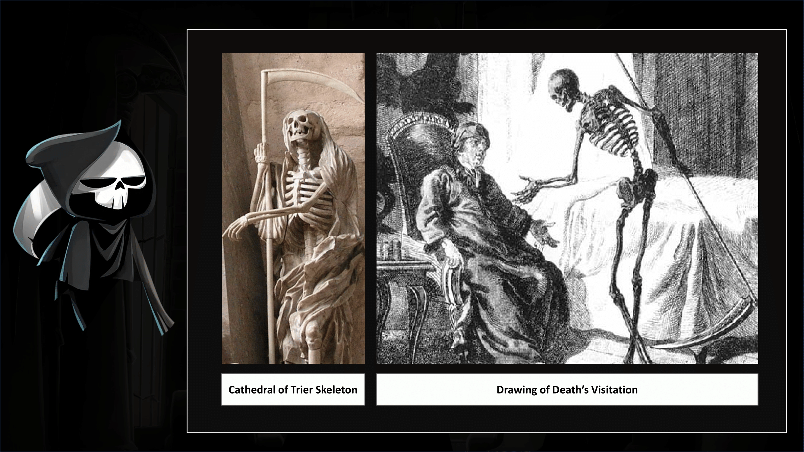
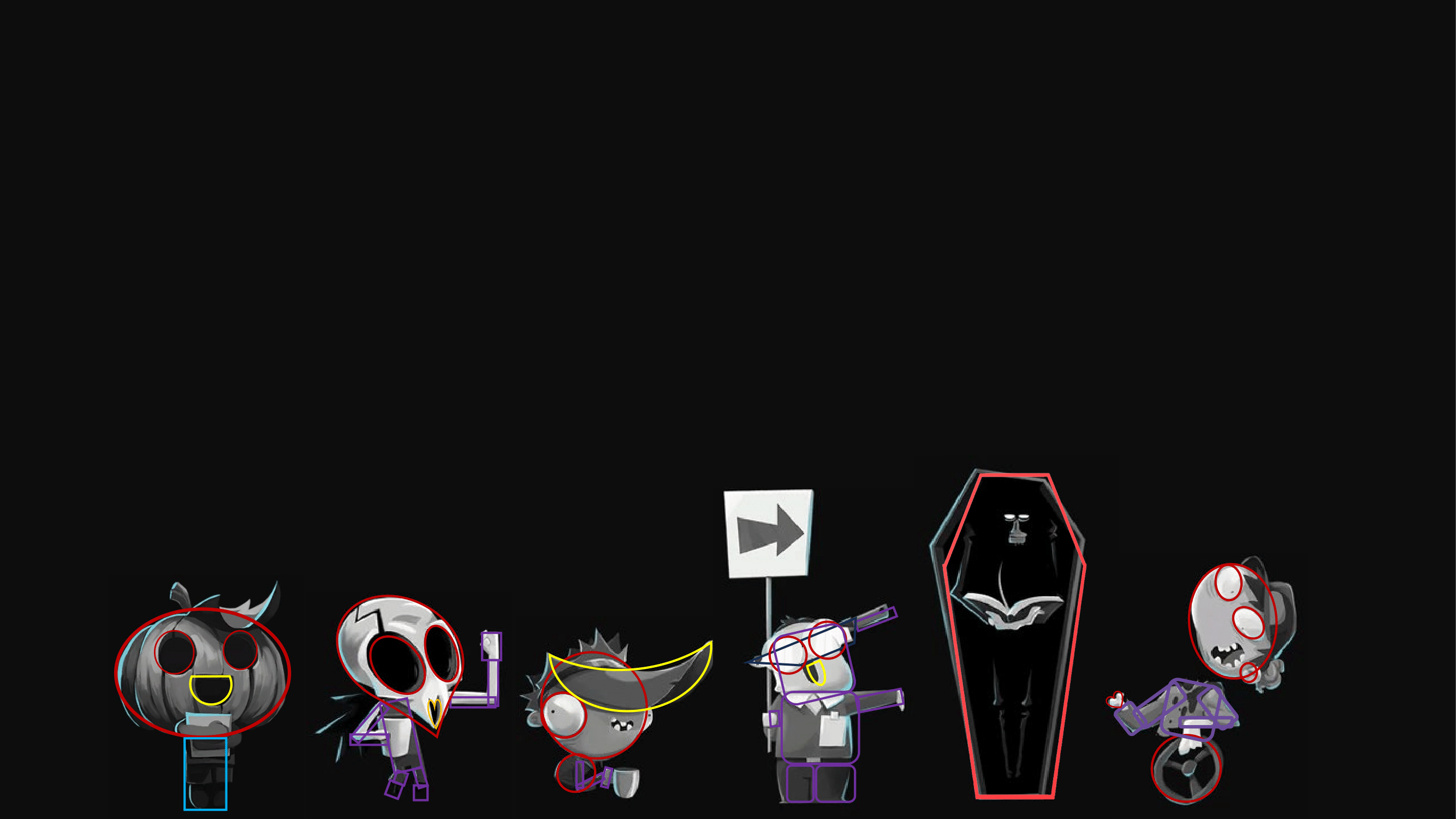
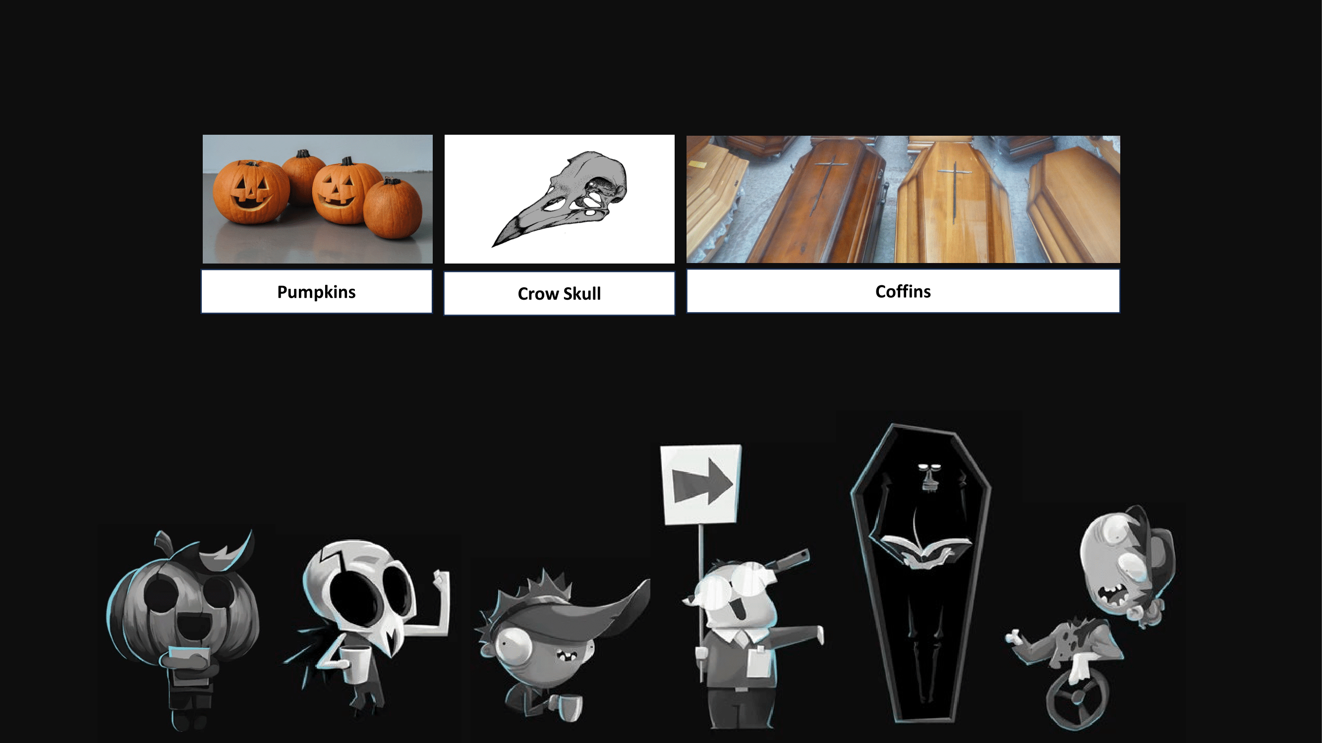
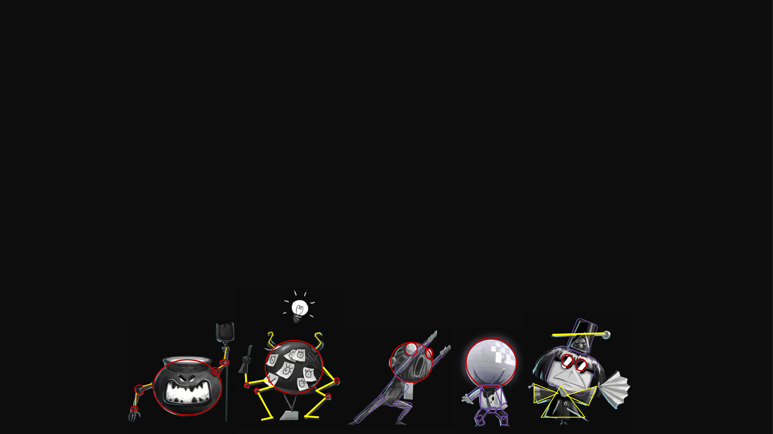
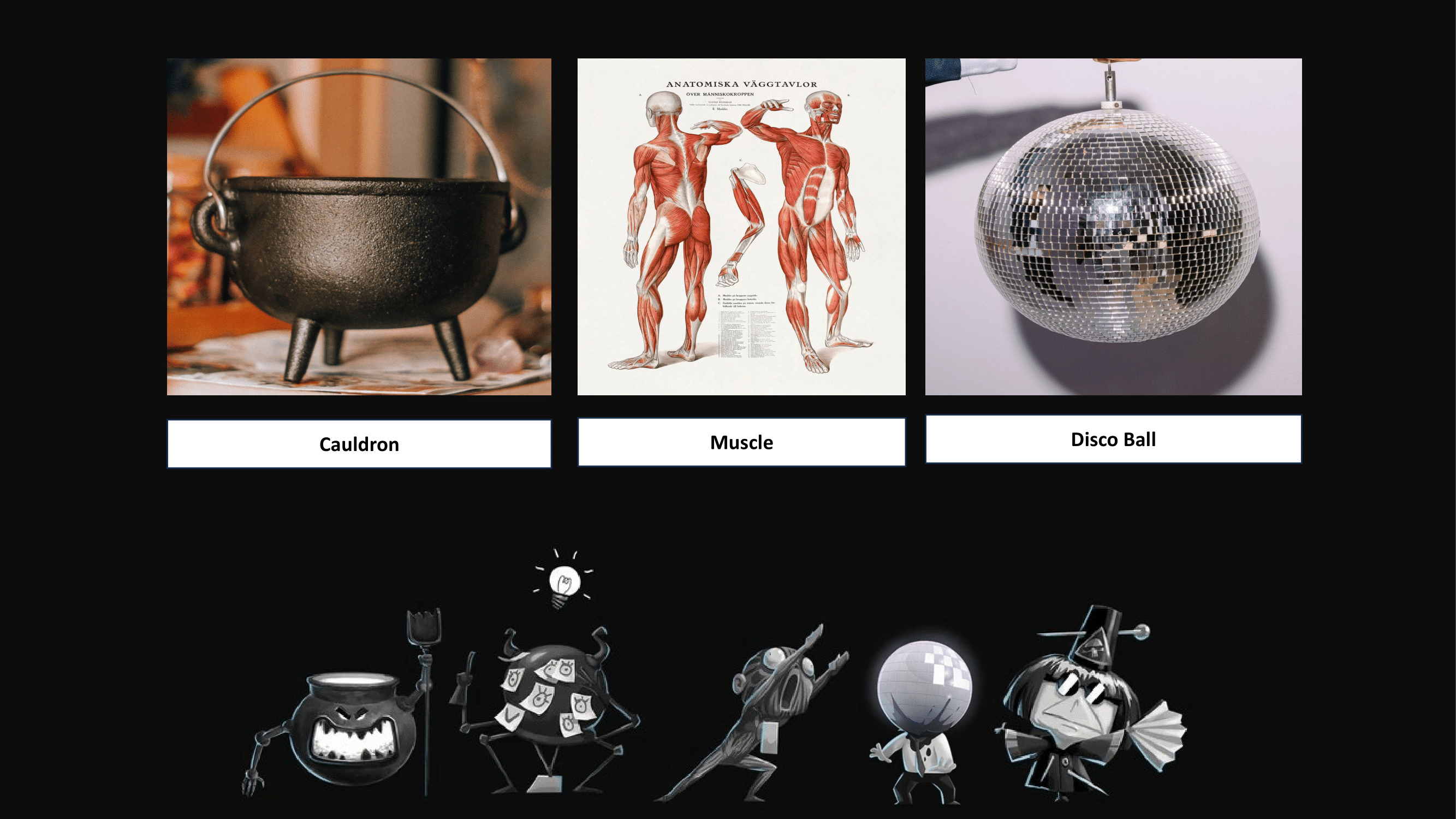
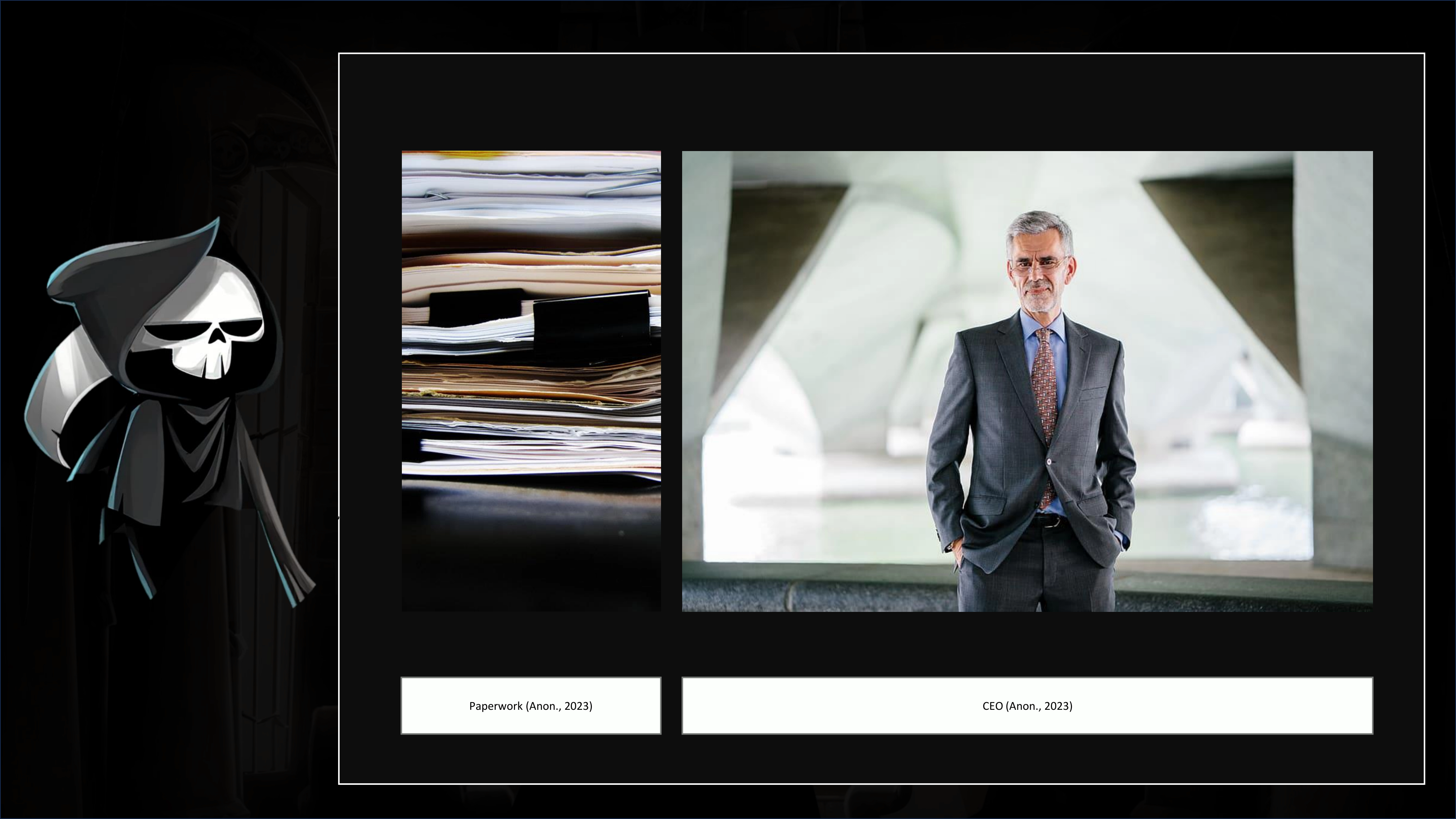
During my initial assignment, I made a mistake right off the bat 😂 (the first of many). Initially, our task
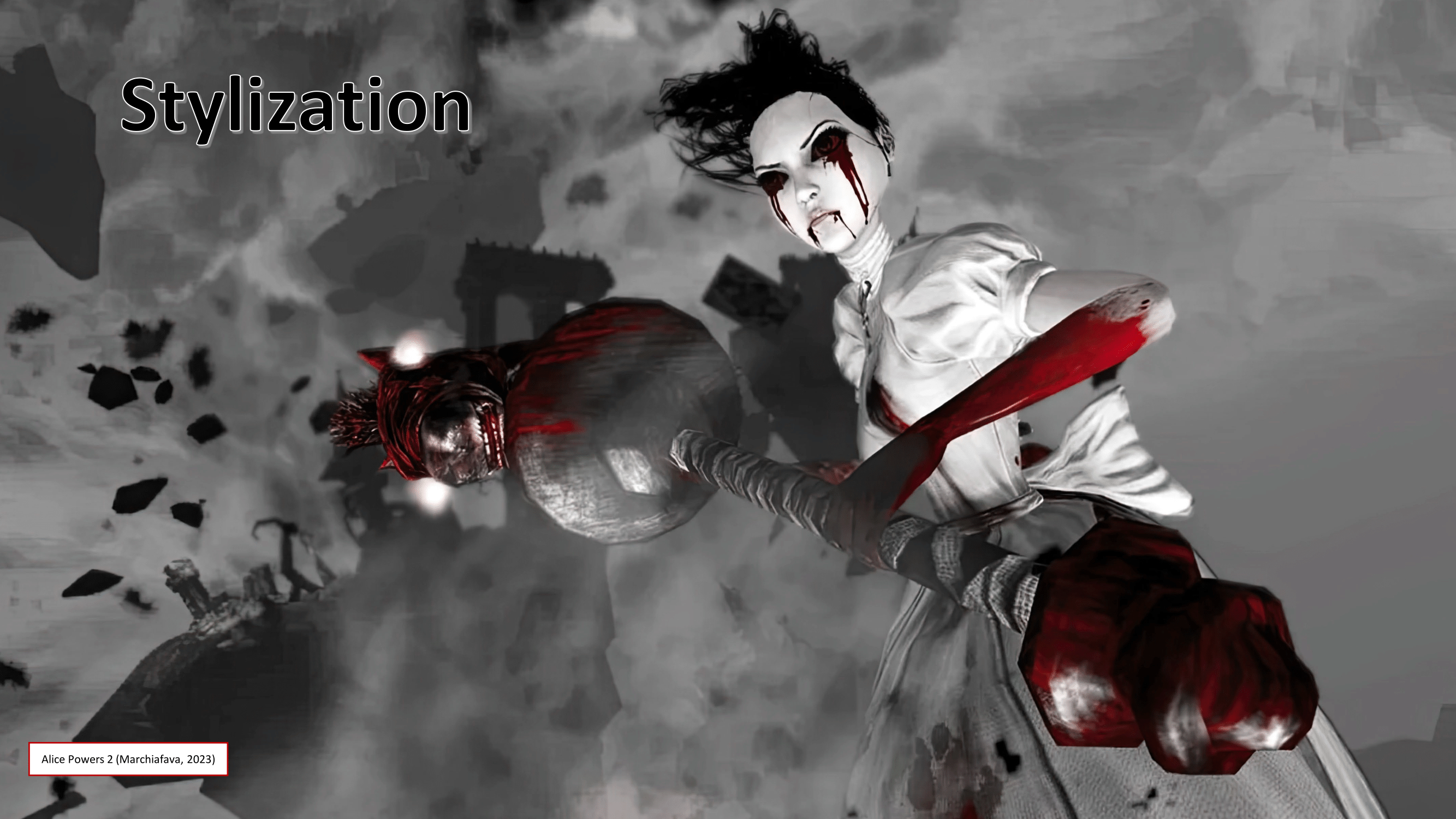
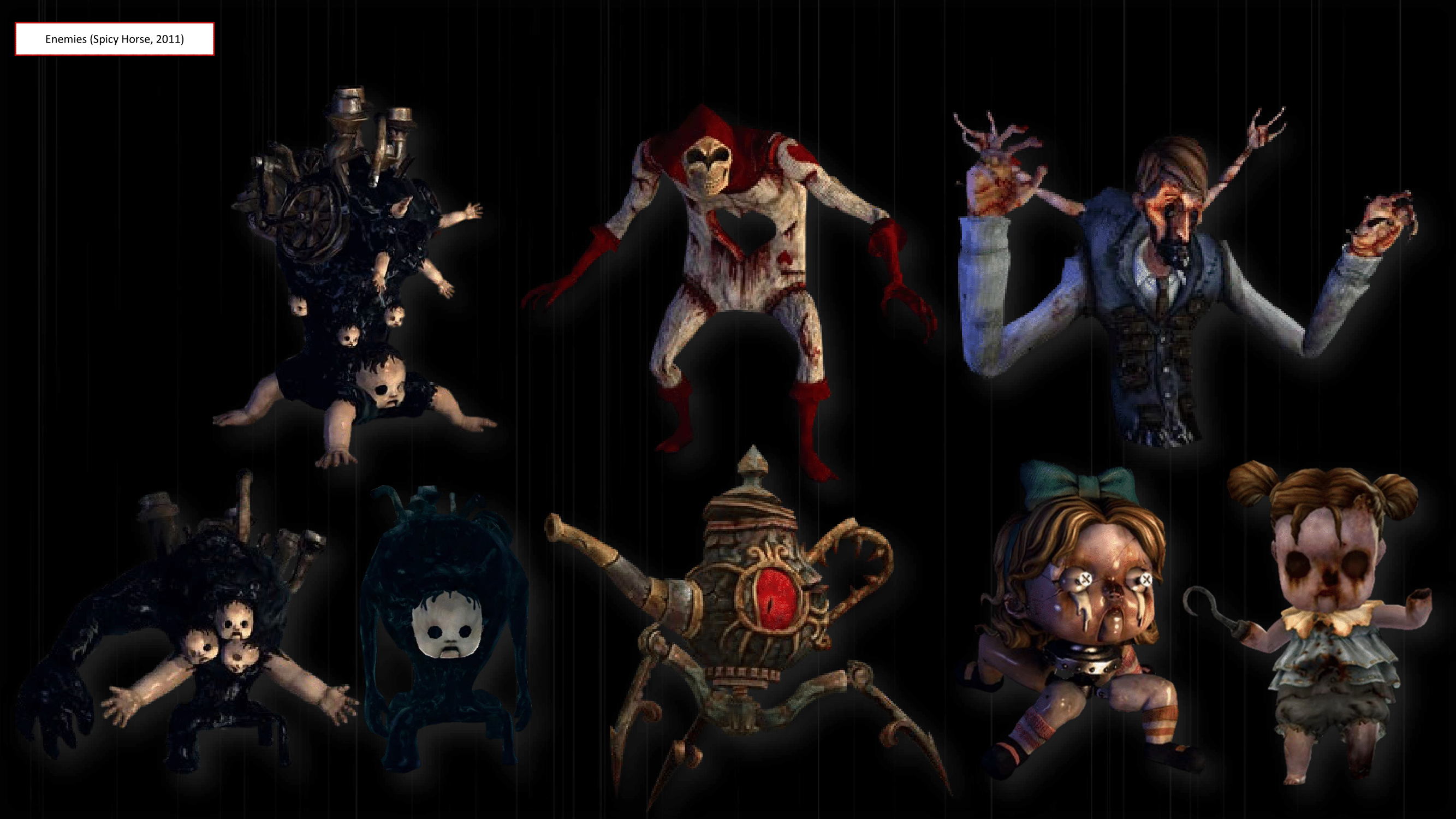
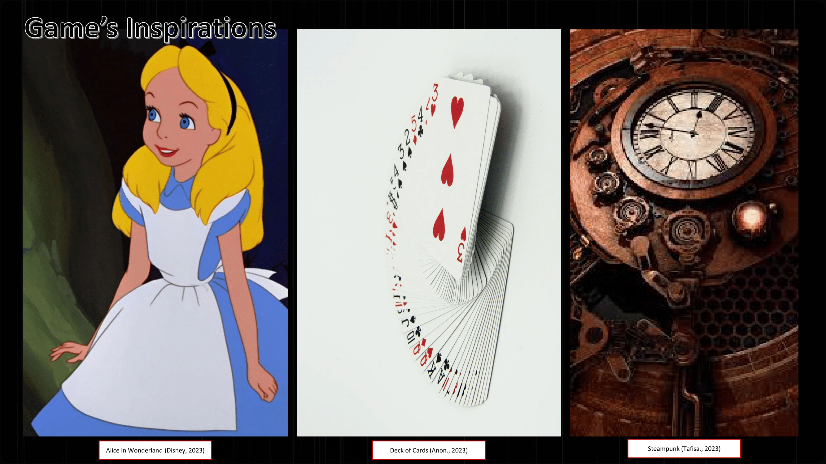
was to select a game from a provided list and create a PowerPoint discussing its design elements. I mistakenly
assumed that this part was the sole requirement for the two sessions at SAE. Consequently, I crafted a
presentation for the game 'Alice: Madness Returns,' believing it was sufficient. However, I dedicated the
following weeks to developing a Design Study for the game I intended to adapt in my Modul project. It wasn't until
just before my presentation that I realized my error. Ultimately, it wasn't a significant issue, but it led me to
have two hastily assembled Design Study presentations.
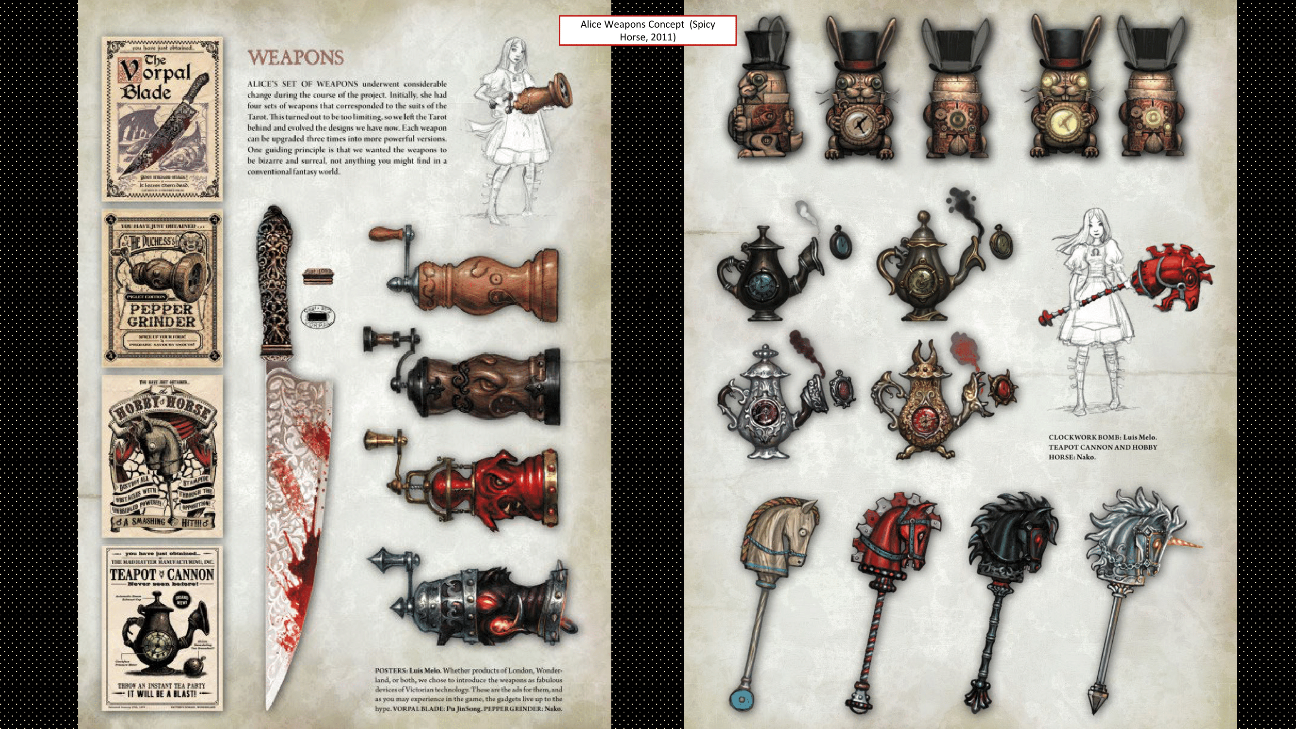
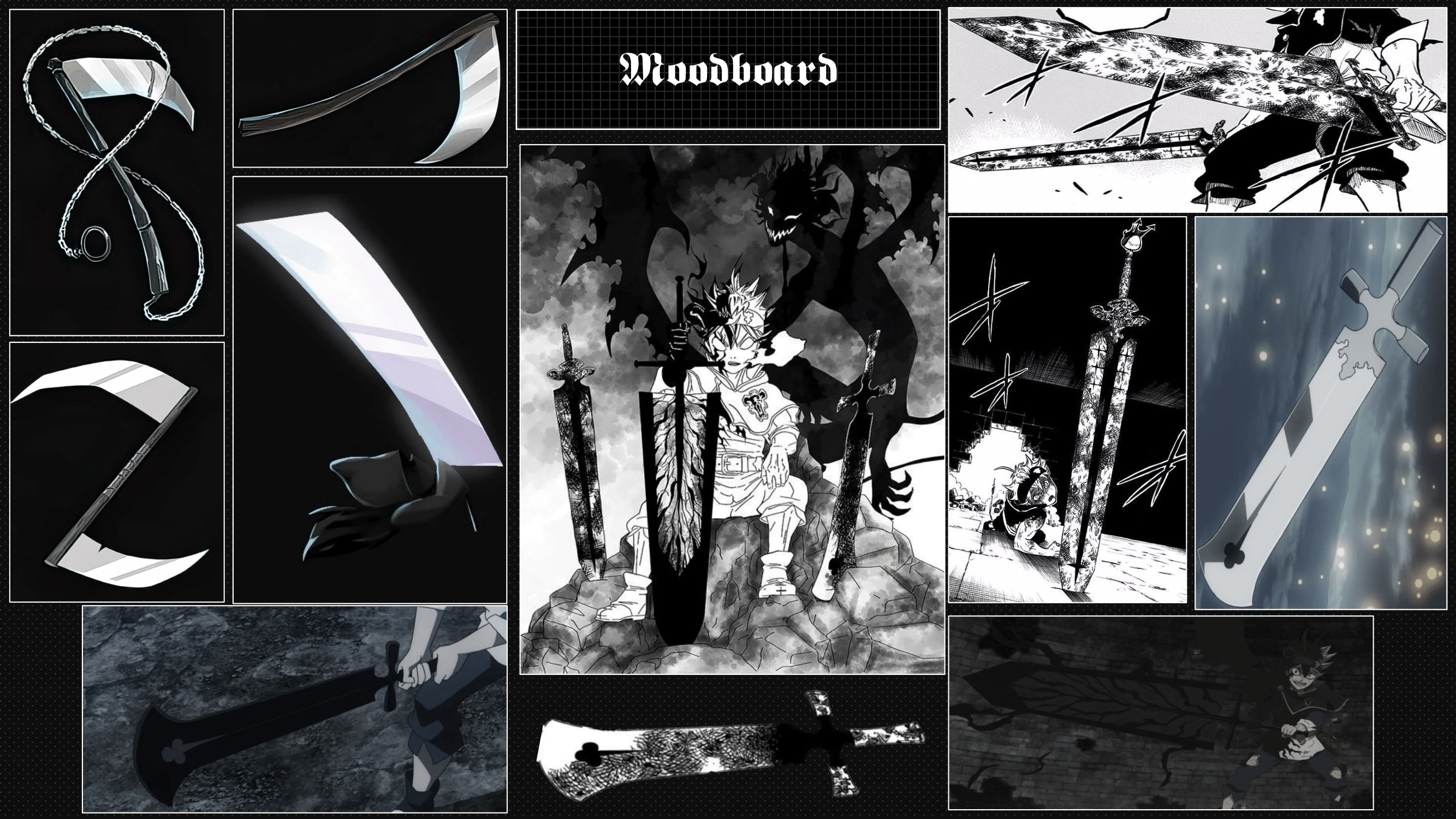
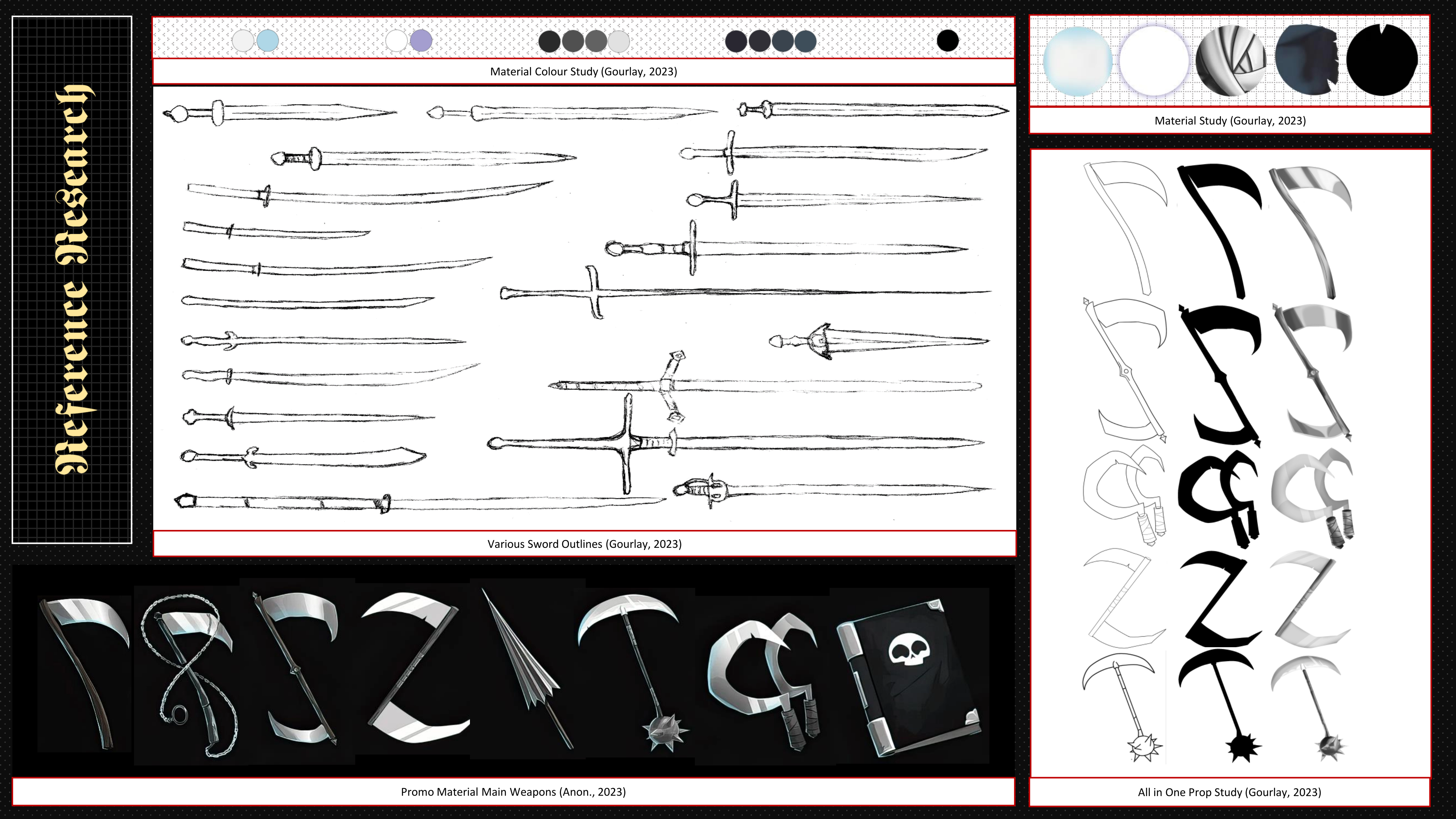
In the second assignment, I need to examine the weaponry design featured in the game I'm adapting, as well as
other items, whether from reality or fiction. The goal of the reference research is to bolster this concept with
templates and develop a comprehensive design analysis for my project.
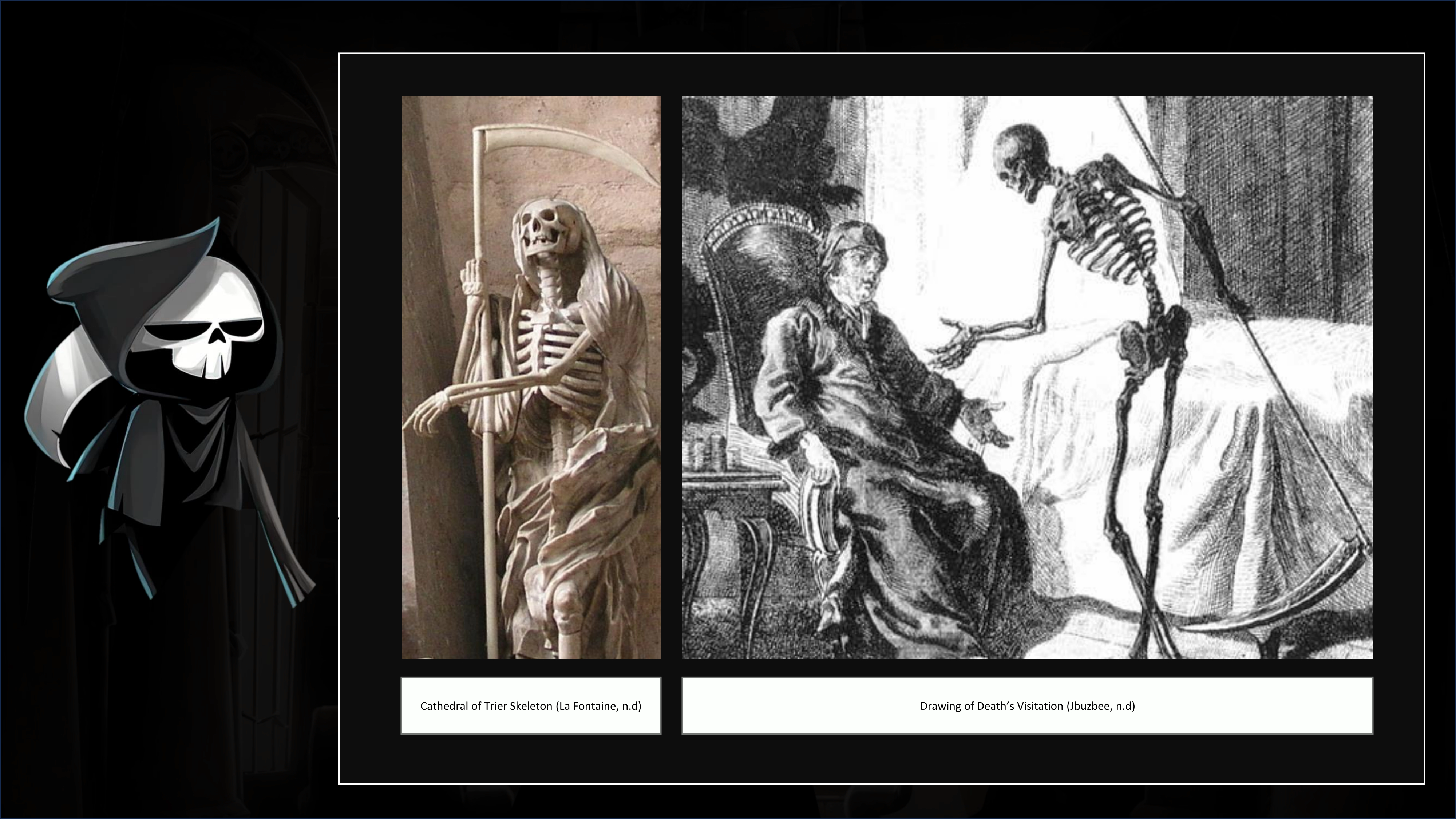
I am required to seek out references and sources of inspiration, properly cite them, and compile a bibliography
using appropriate citation formats. Additionally, I must conduct in-depth analyses of at least five selected
references. Subsequently, I need to produce a mood board and a design blueprint focusing on the pertinent elements
of my project concept.
Proficiency
Werden Fachbegriffe korrekt verwendet?
Wurden sinnvolle Erkenntnisse aus der Analyse
gezogen?
Process
Wurden alle verlangten Aspekte analysiert?
Wurden Details betrachtet?
Person
Wurde
die Präsentation sorgfältig vorbereitet?
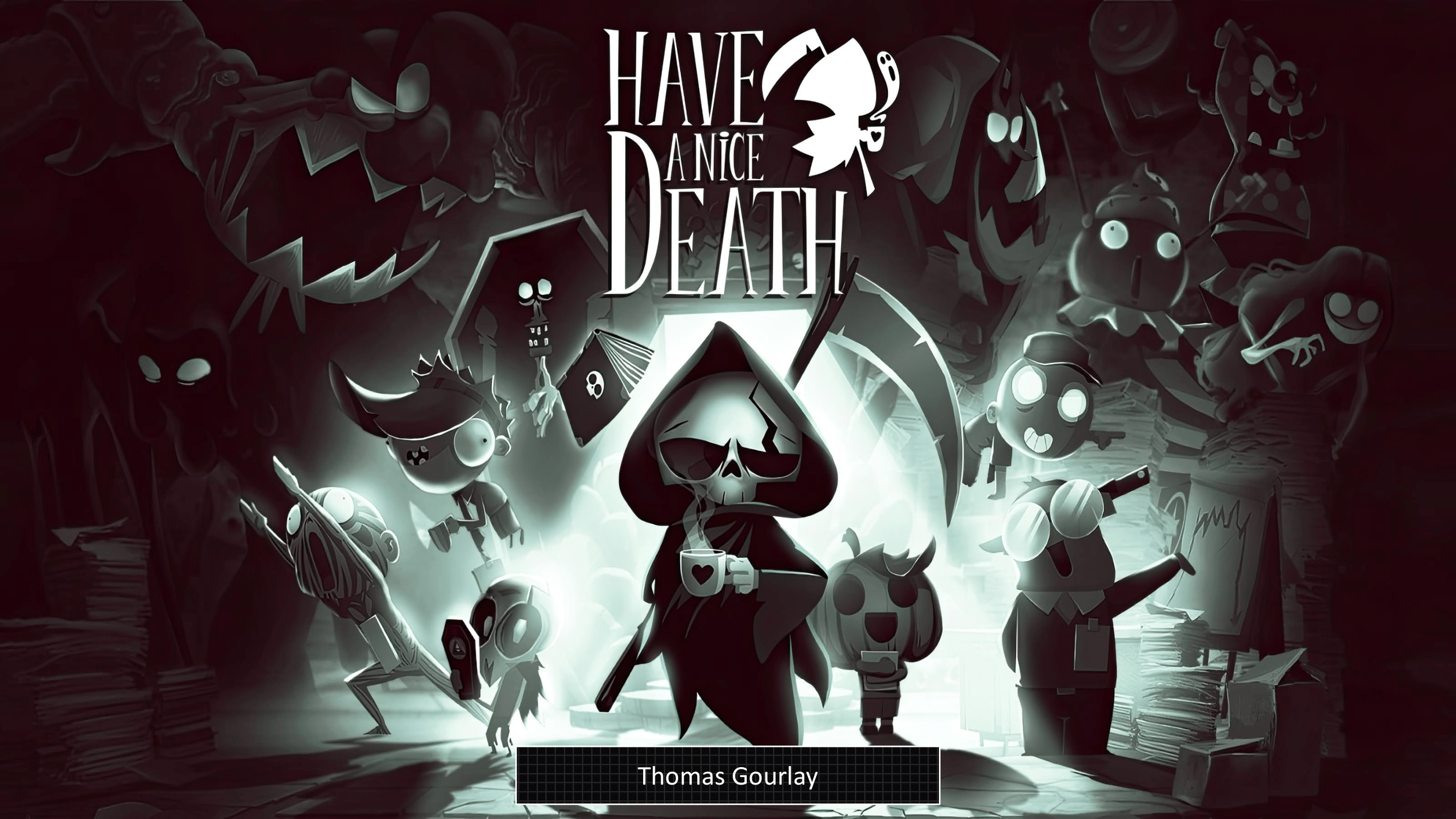
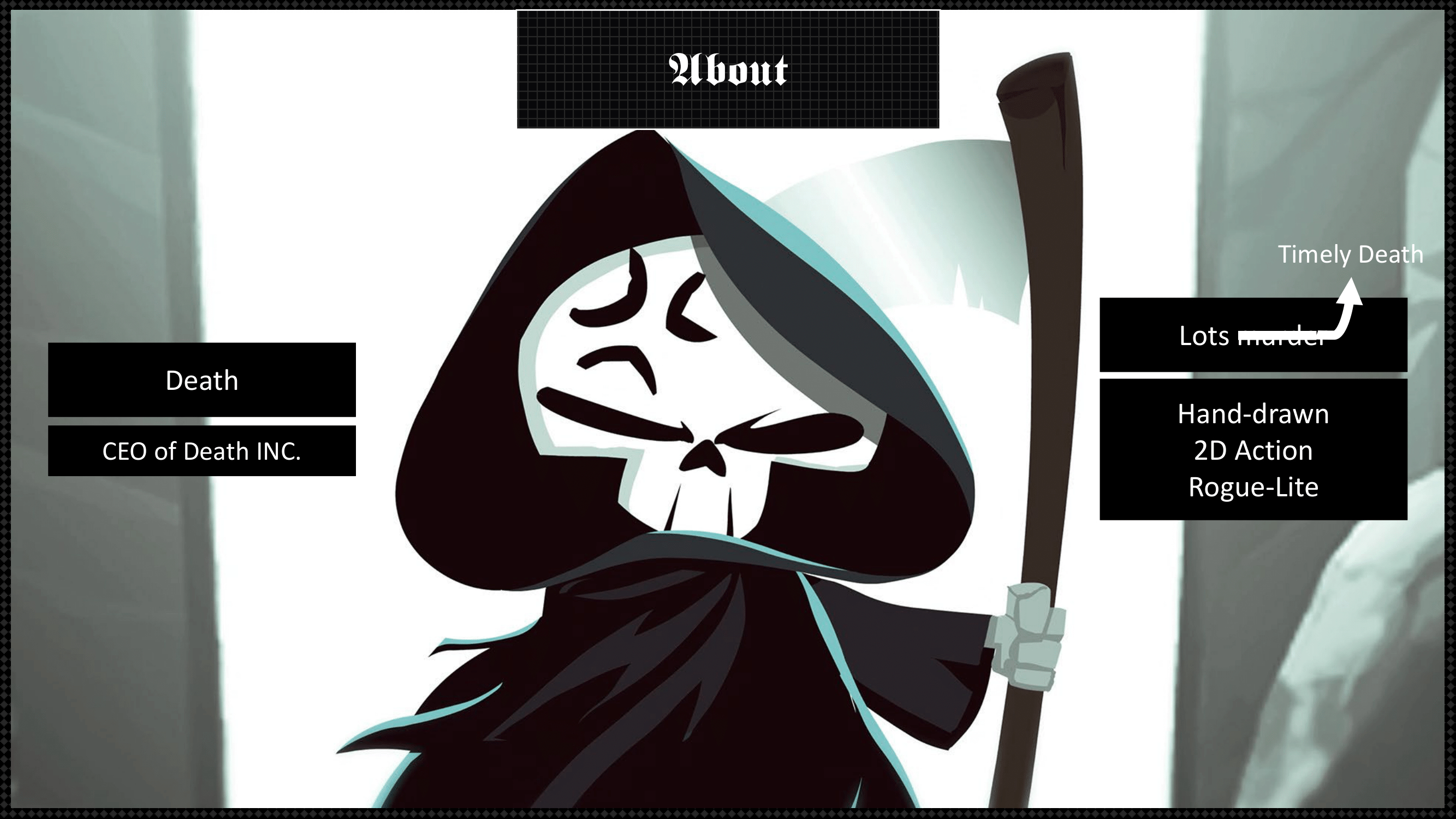
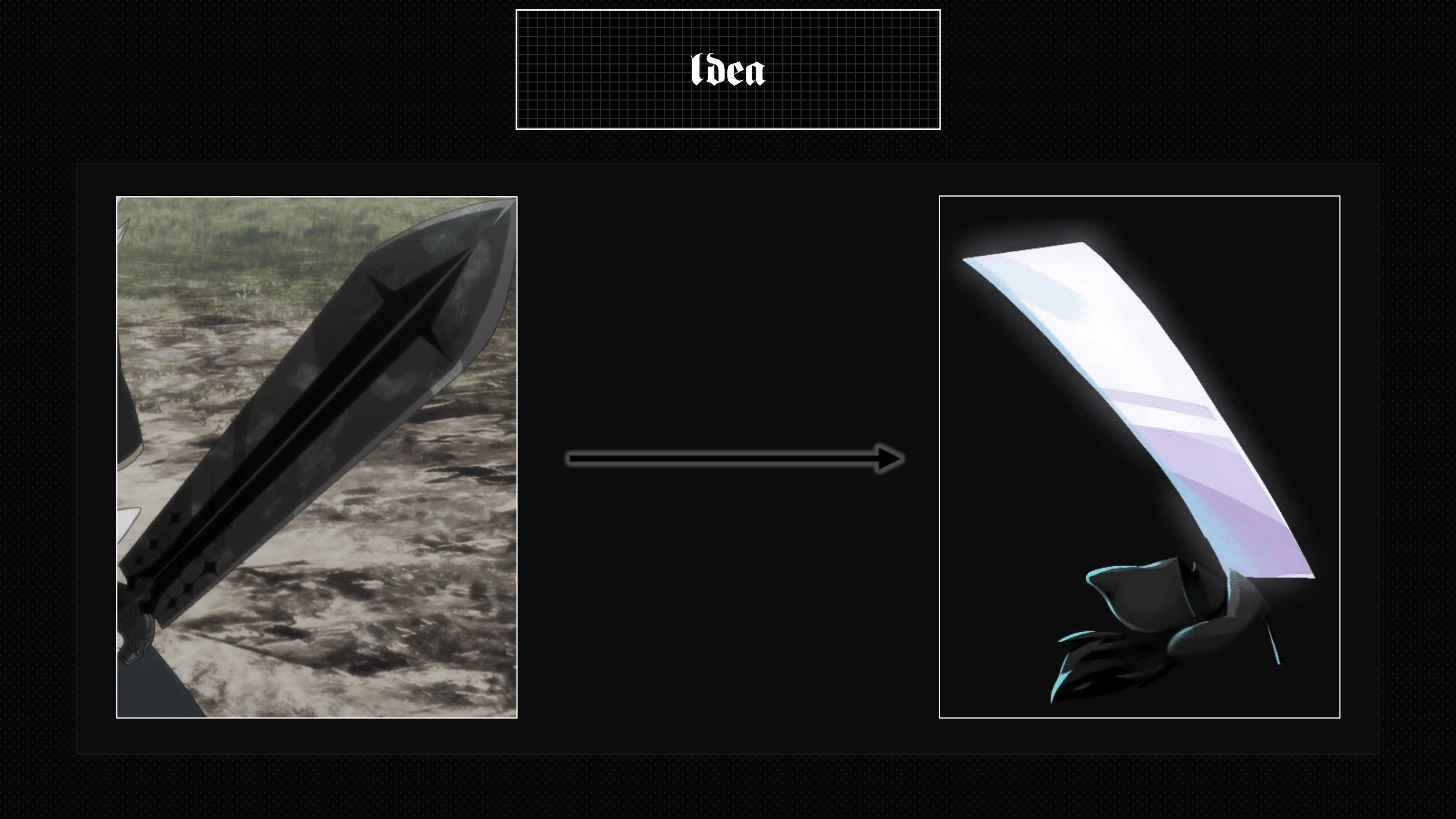
I encountered challenges during my reference research. Initially, I aimed to incorporate a sword from the
anime 'Black Clover,' but the visual characteristics of the swords didn't align with the aesthetic of the game
'Have a Nice Death.' Despite this, my preference was still for a sword. Consequently, I gathered numerous images
of swords and conducted detailed studies focusing on the weaponry featured in the game.
This assignment is about continuing your my project idea and creating (analog) drawings of my topic.
I encountered challenges during my reference research. Initially, I aimed to incorporate a sword from the
anime 'Black Clover,' but the visual characteristics of the swords didn't align with the aesthetic of the game
'Have a Nice Death.' Despite this, my preference was still for a sword. Consequently, I gathered numerous images
of swords and conducted detailed studies focusing on the weaponry featured in the game.
.png)
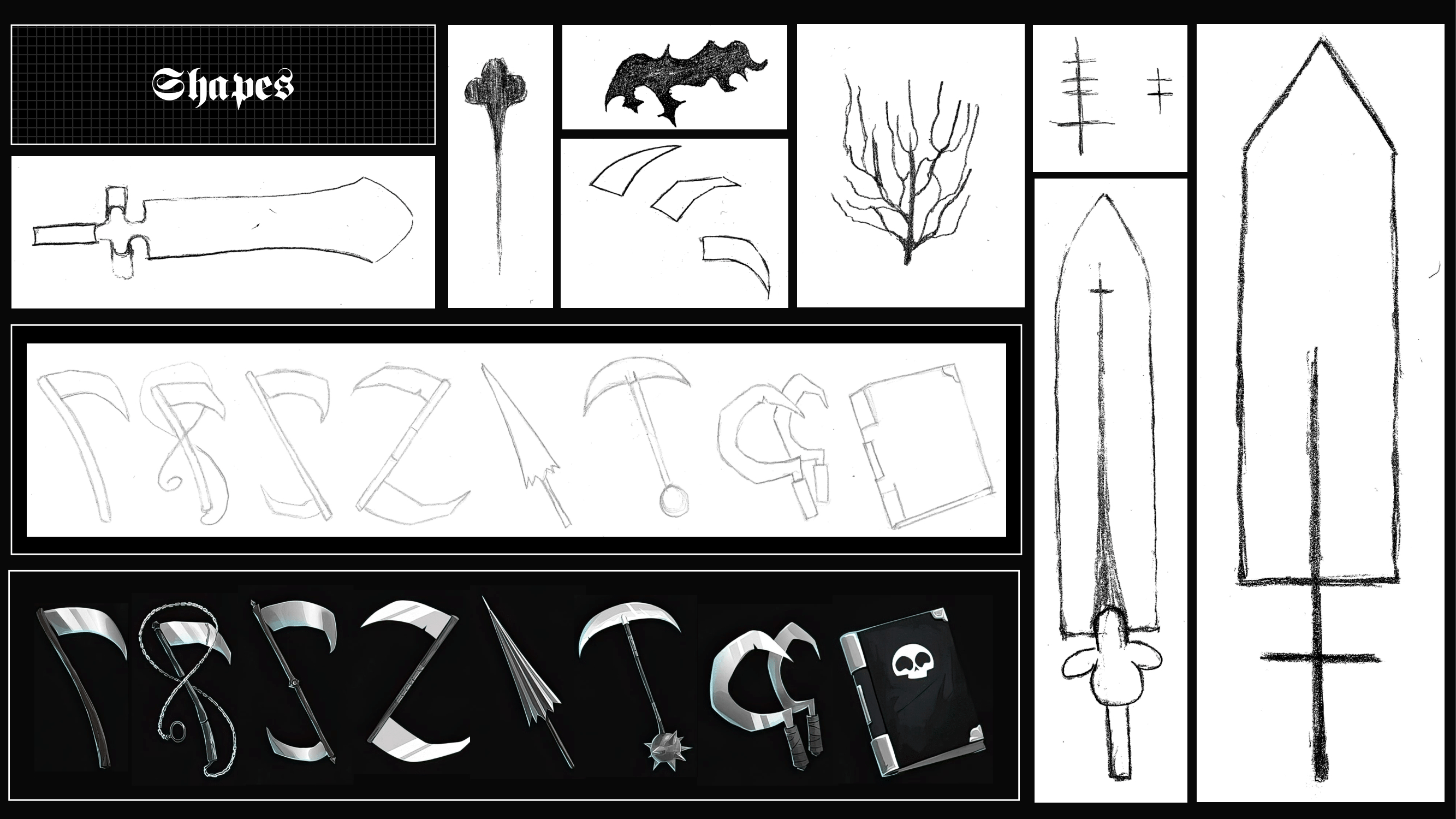
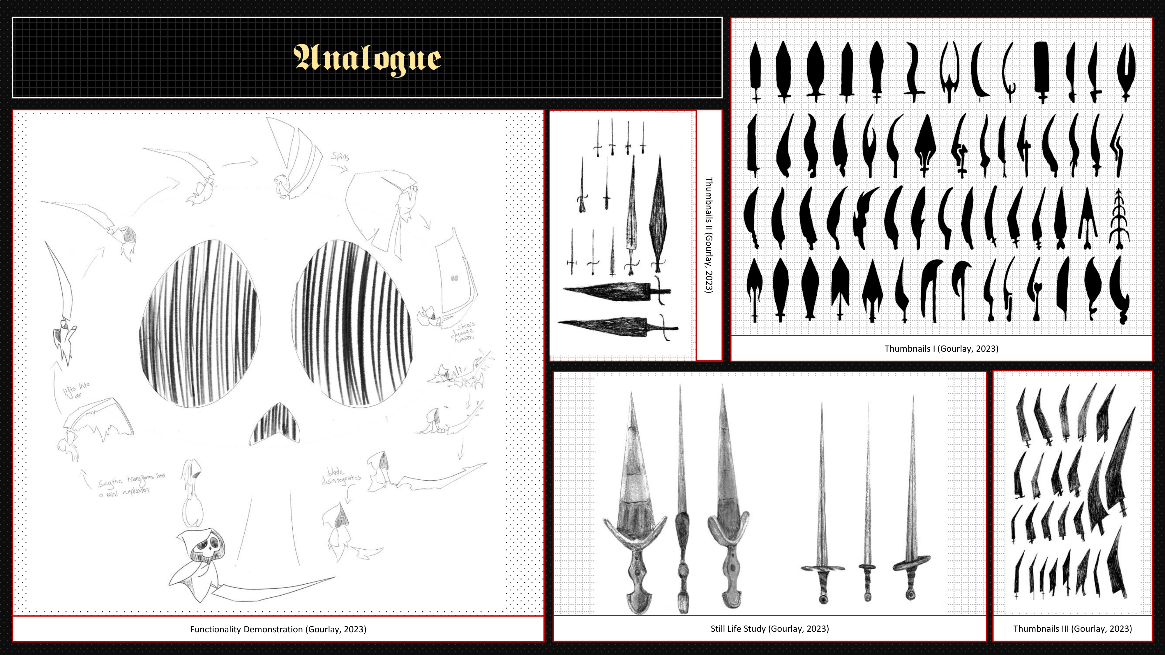
The aim of thumbnailing is to use the formal language of the Design Blueprint to sketch many swords the size
of a thumb and to experiment with the shapes. Sometimes you already have a design in mind and set on it, however
creating alternatives can help you discover designs you did not imagine at first. For example, if there are 50
design options are available, there is a high probability that you will find the closest to the "best" or "most
suitable" design. Especially if you are working in a team or with customers, a large selection also provides good
material for discussion.
.png)
.png)
The quantity of thumbnails is important here, the quality then comes in the next steps. I first made
thumbnails, seeing if I stumble upon any designs I like. However, a lot of them don’t feel they would fit in with
the game. I then went back to a more stylised design of the two still life swords. While they could potentially
fit withing the game art style, I was still not completely satisfied with it. So, I then just focusing on the
shape language from the game itself. This led me to a design I liked a lot. So, I went back to my reference
research and made a design that felt more in line with the game. Having a very large and edged design.
.png)
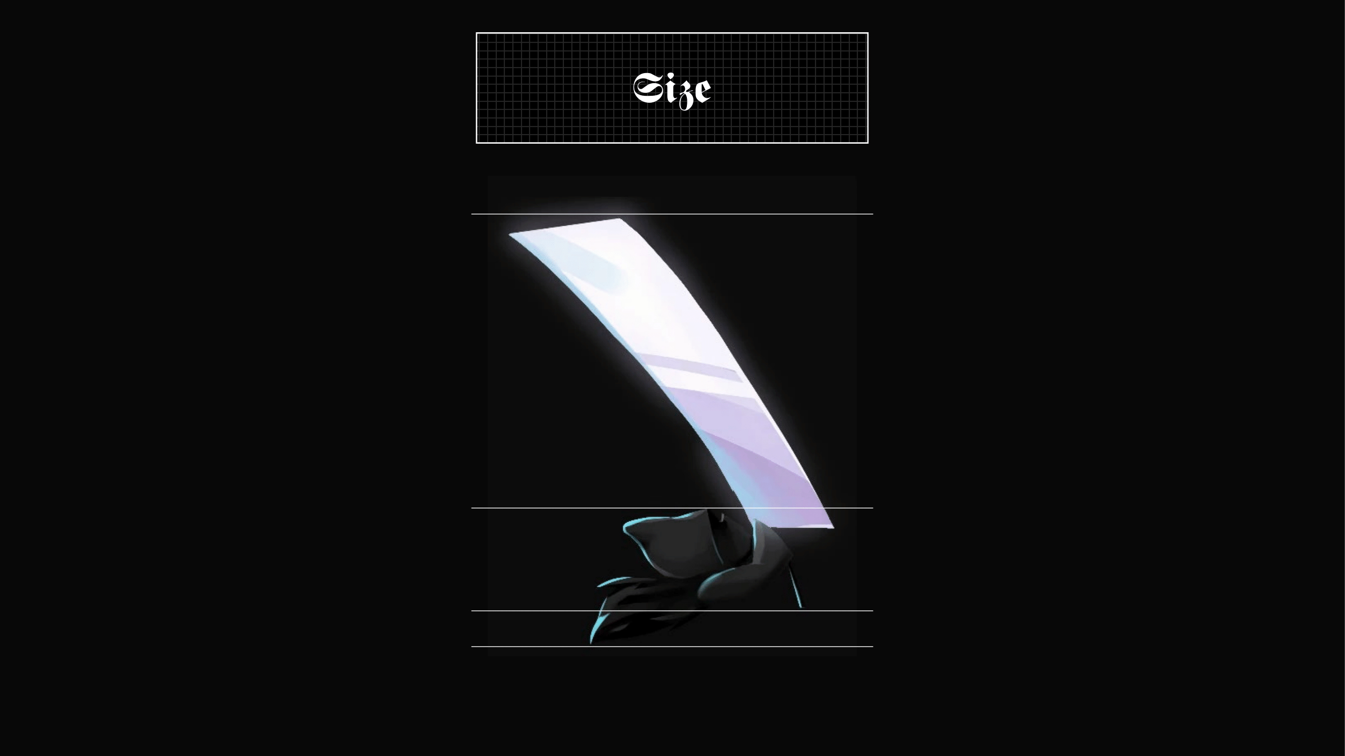
Death holds the sword in his left hand. Once the attack button is pressed, the sword begins to glow as he
jumps in the air with the sword beneath him. He lifts the sword in front of him until it is vertically above him,
and begins to slam it forward, slicing the enemy.
This task refers directly to the previous task "Conception". The task now is to digitize and further refine my
(analogue) drawings.
I had to Digitize at least one thumbnail and use it to develop a further 5 thumbnails.
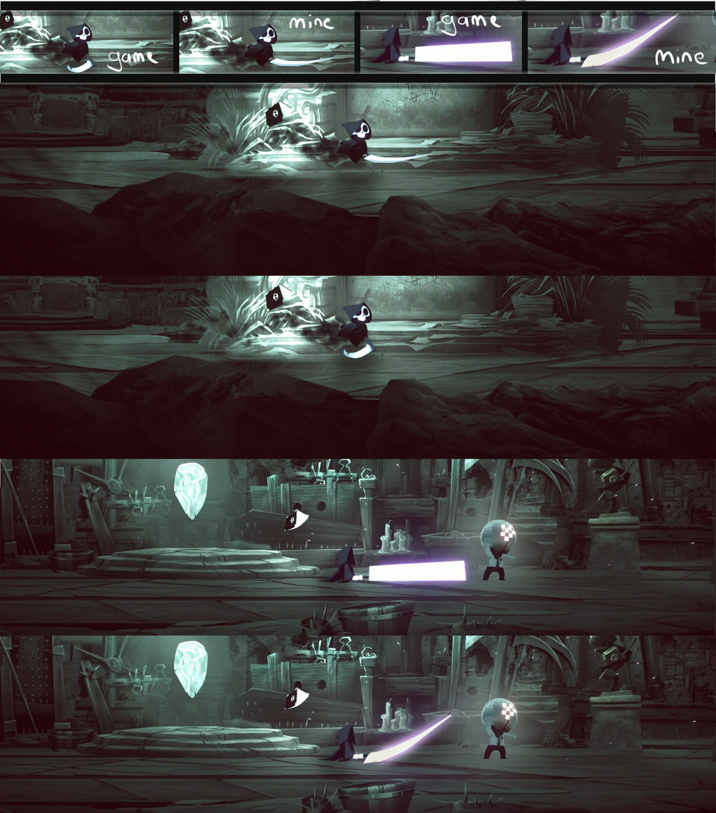
Digitize the material studies. Digitally color at least one orthographic view. Render the 3/4 view completely
colored with textures. Present the result with a side-by-side comparison/in-game composite
.png)
.png)
The weapon I decided to use is this more edged style. I also gave it a hilt that looked like a cross when
held up right. While I Initially liked it, I came to the realisation that it might still look a bit out of place
when placed next to the weapons of the game. The design is too rigid.
.png)
.png)
.png)
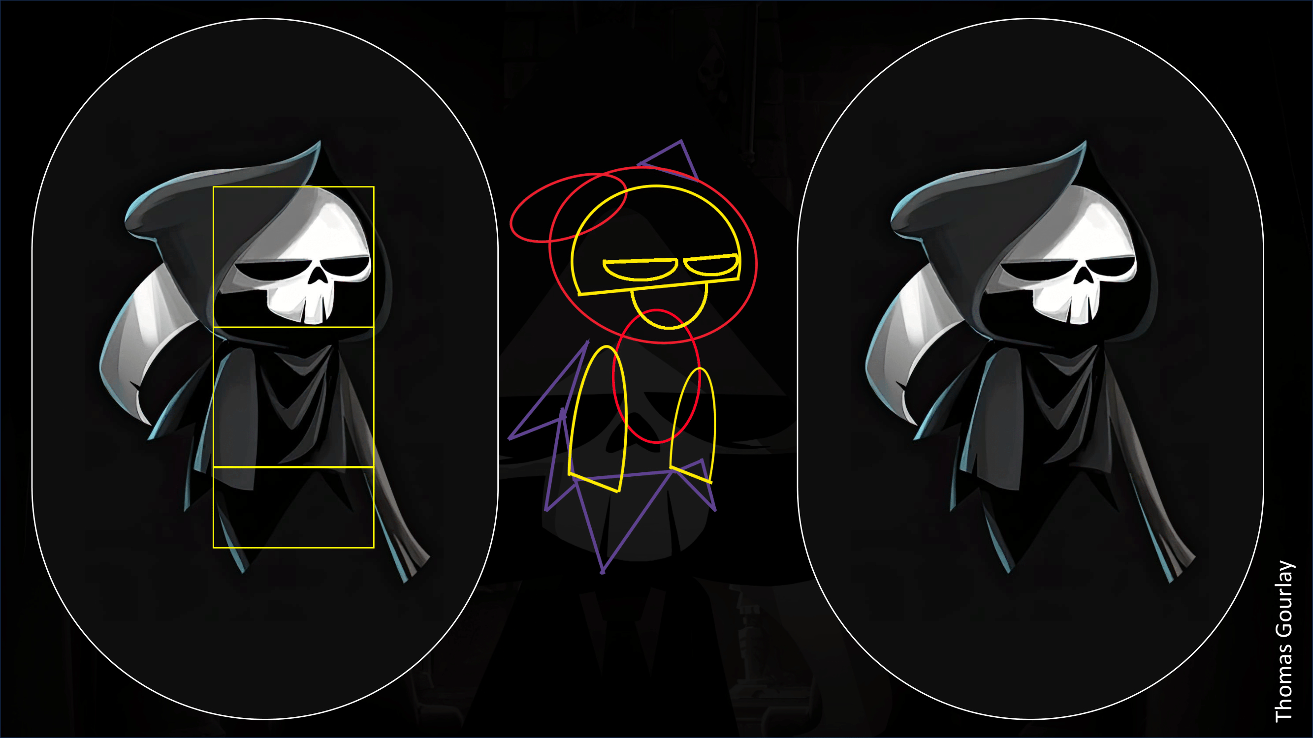
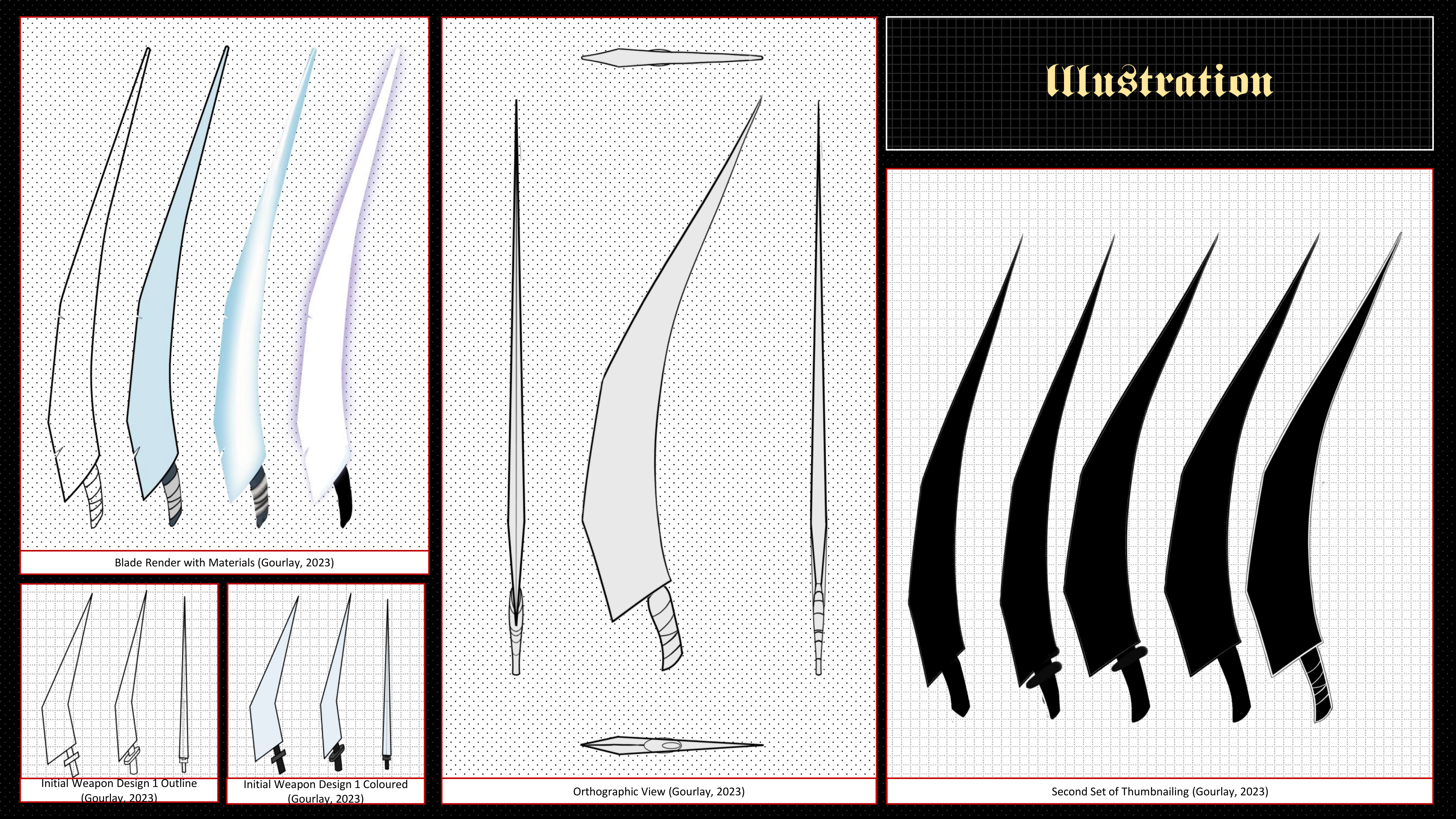
Looking at the blades of the game I followed the shape language of having both curves, and rigid edges. So, I
made the front of the blade have three straight edges while the back of the blade is entirely curved. I also
removed the hand support of the handle since it was unnecessary to the design.I also created the Orthographic and
Perspective view from the design of the final Thumbnail.
.png)
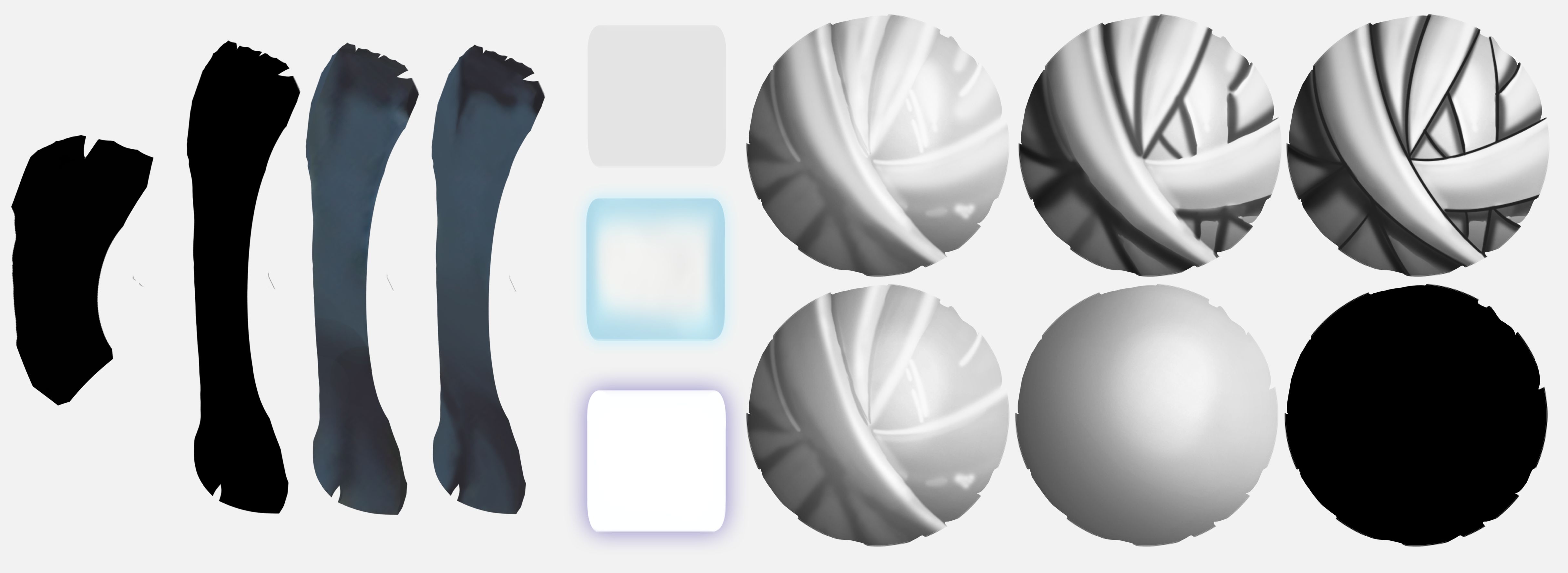
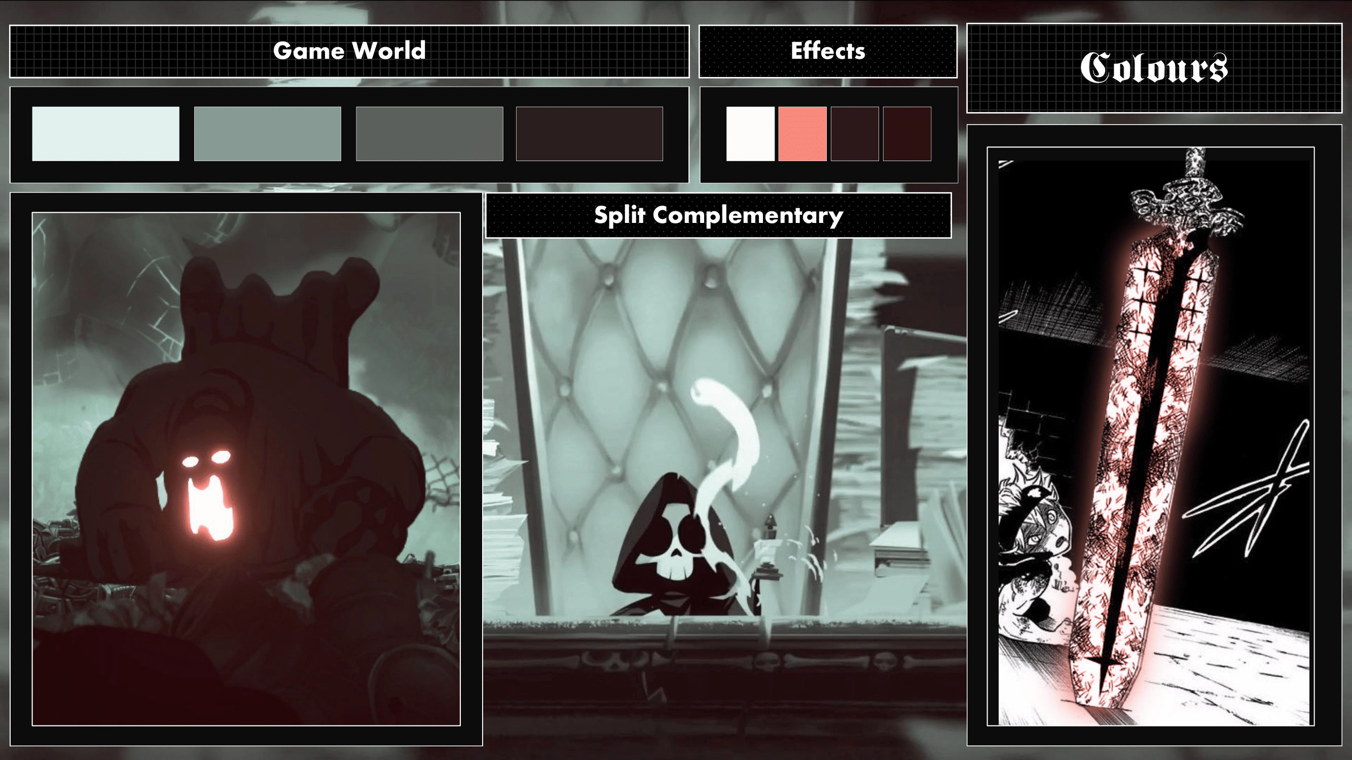
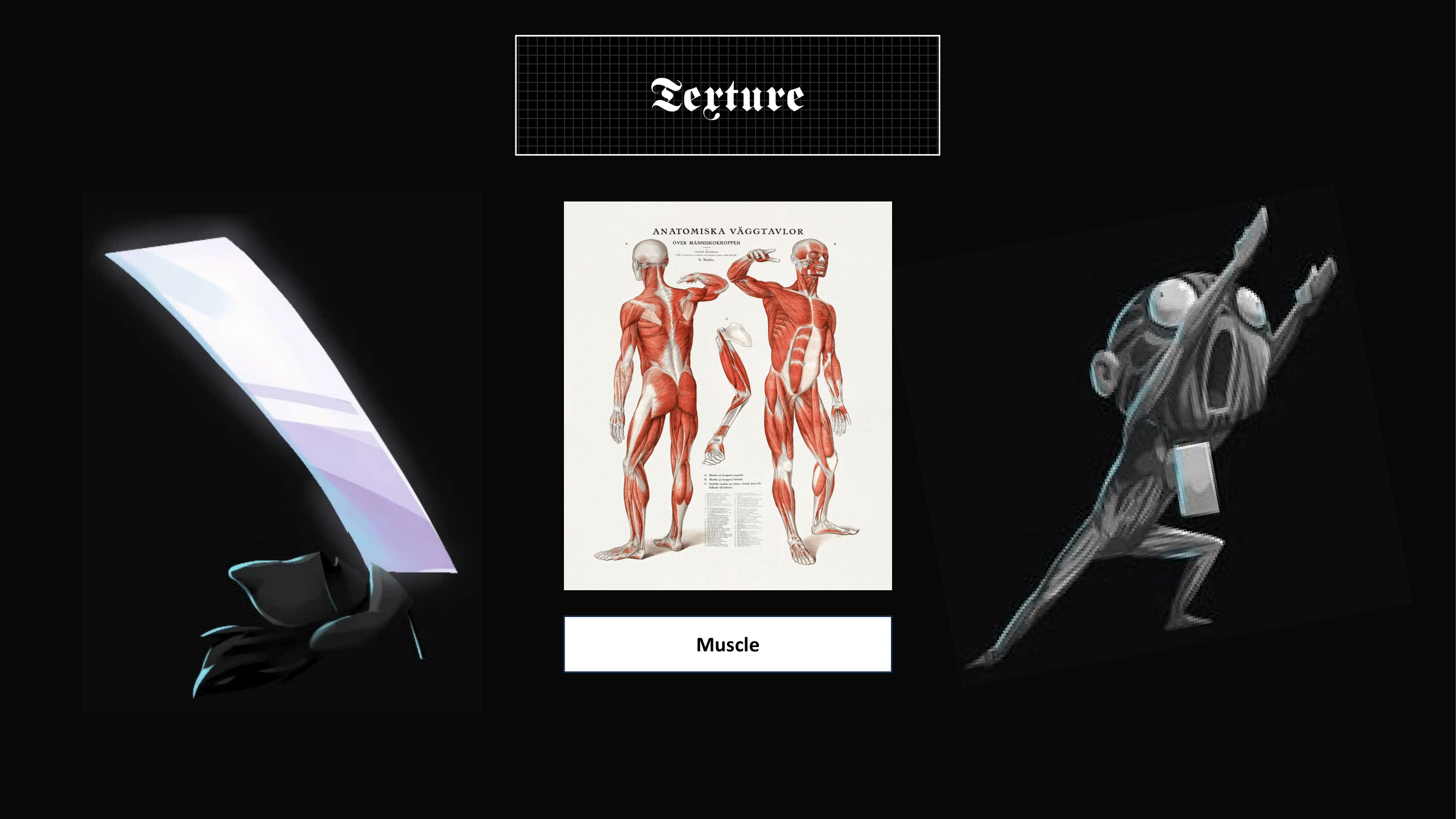
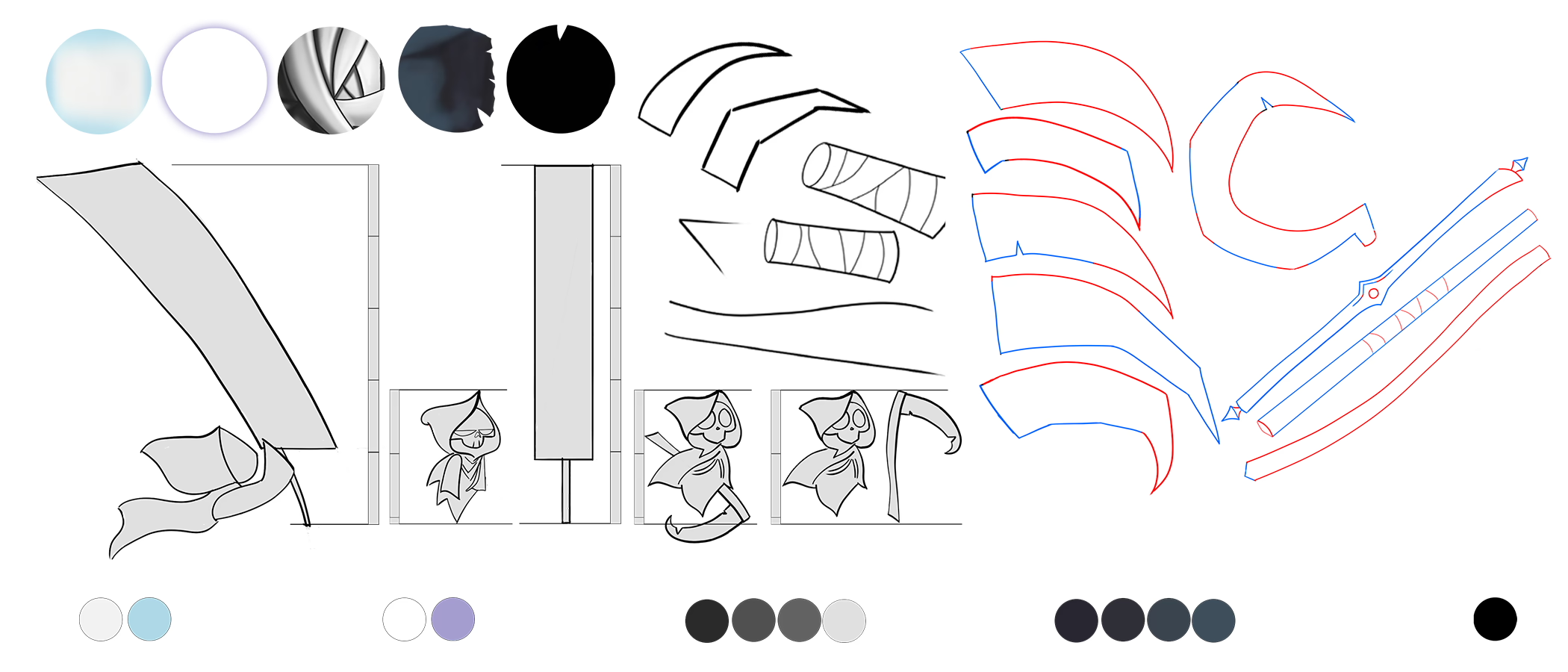
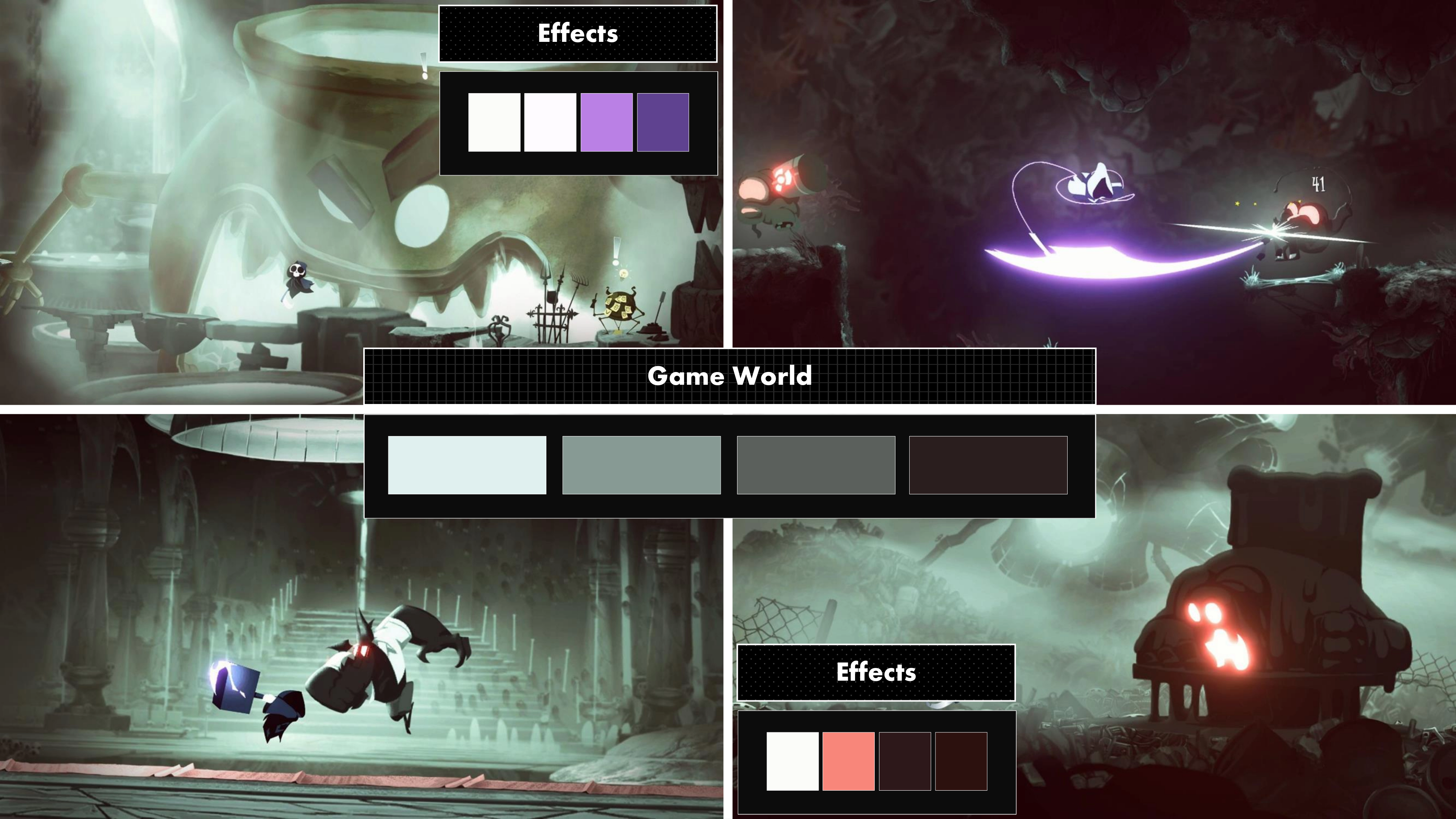
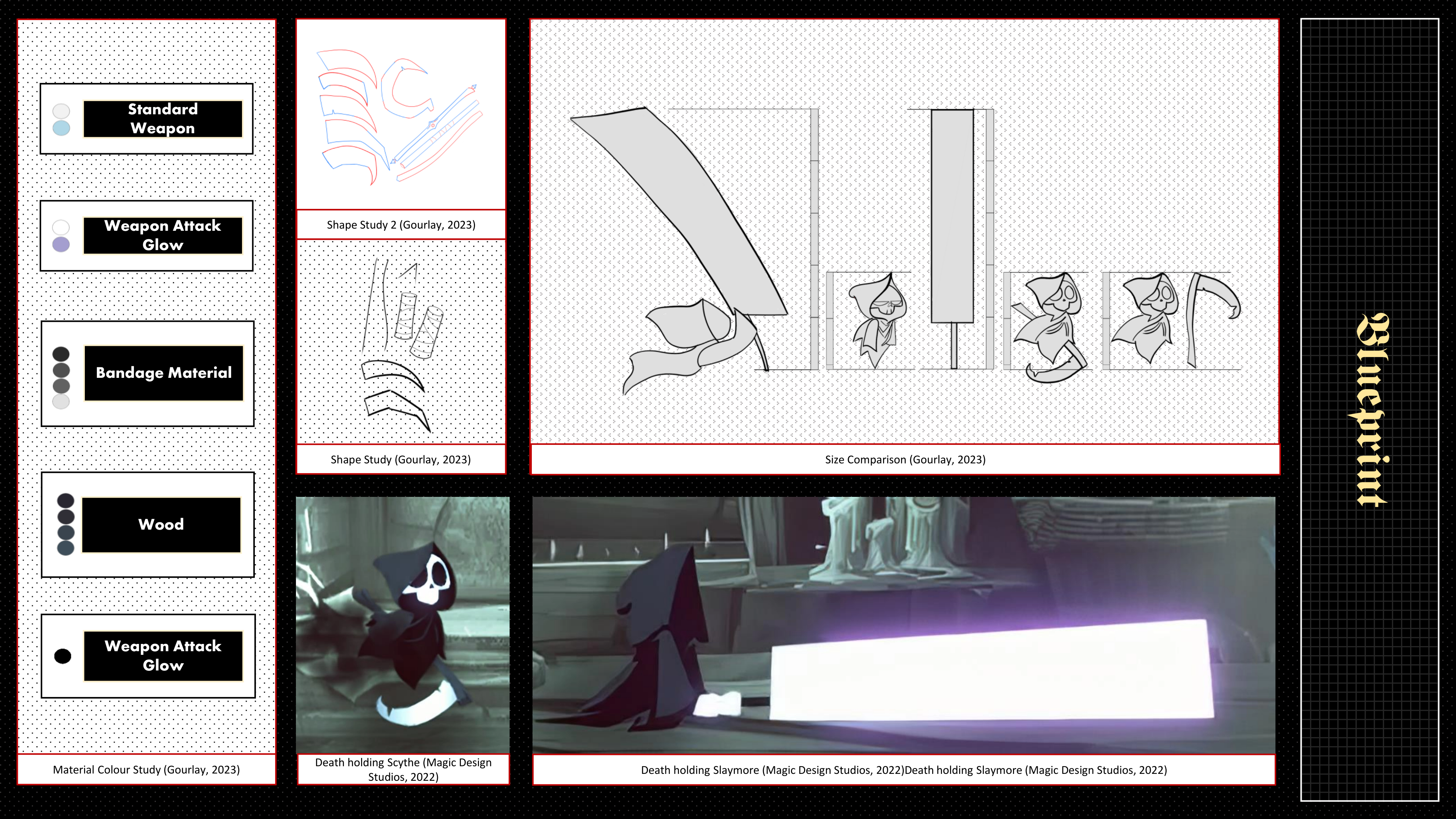
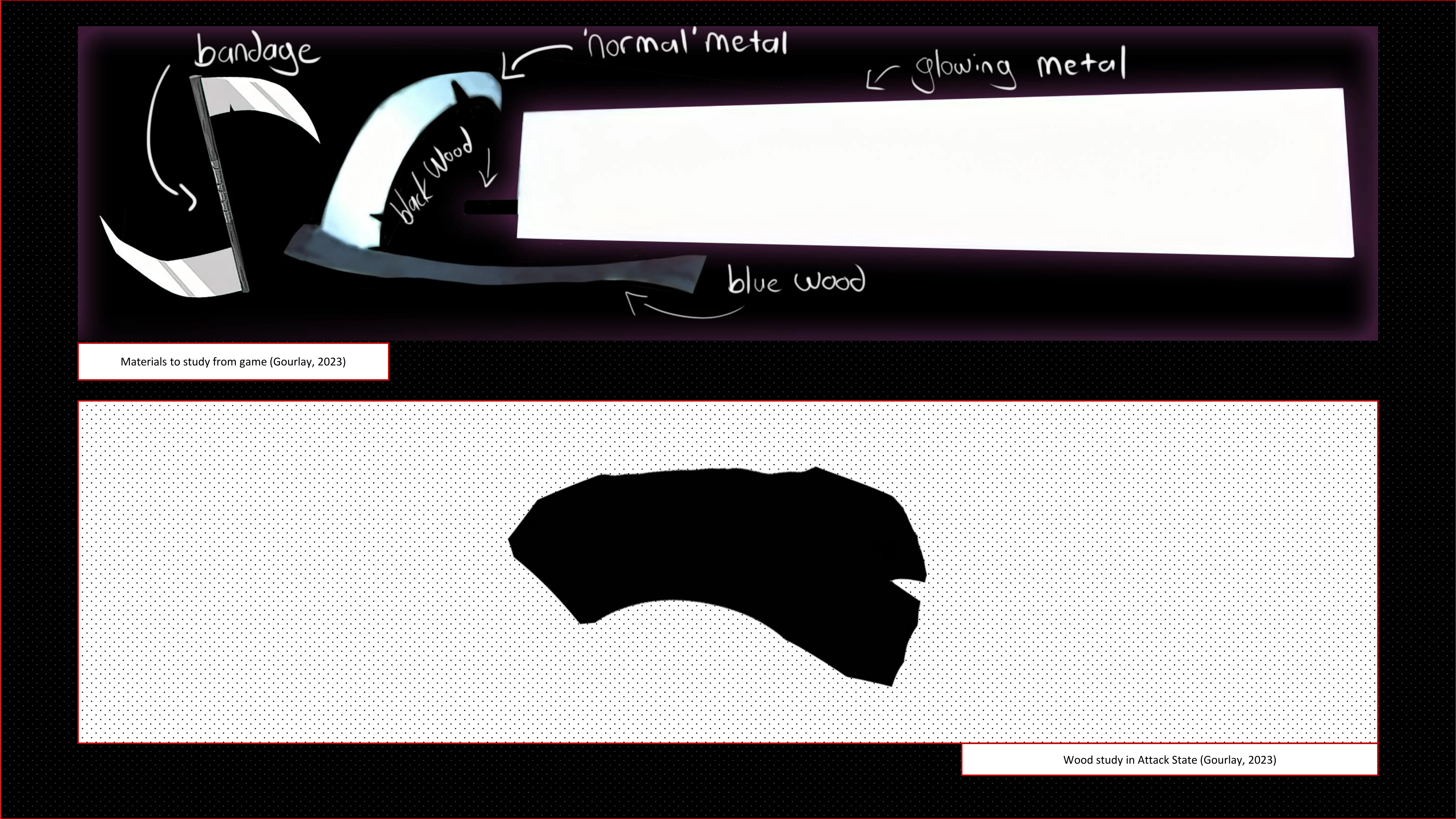
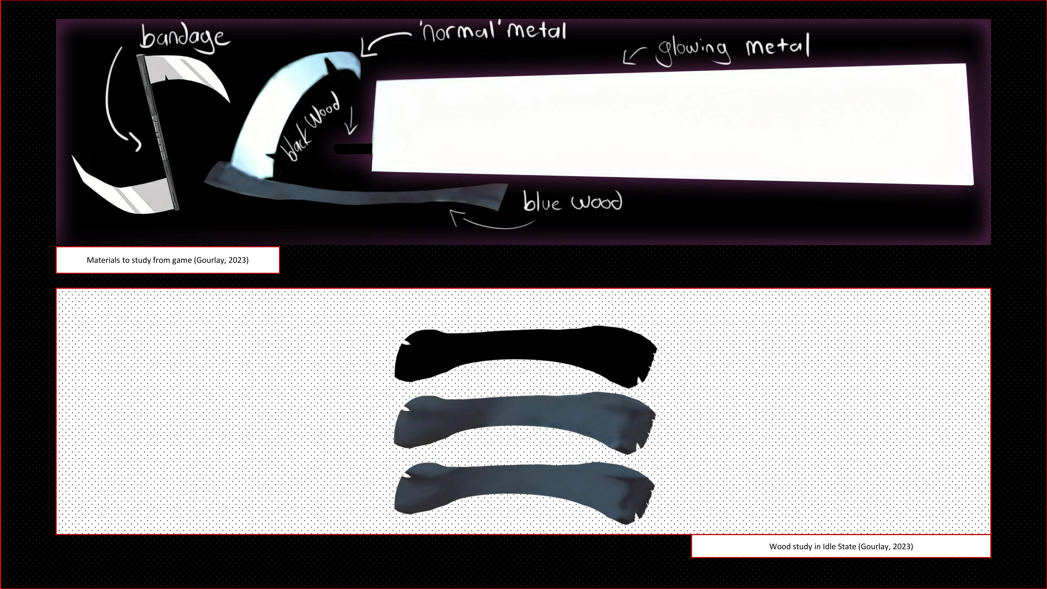
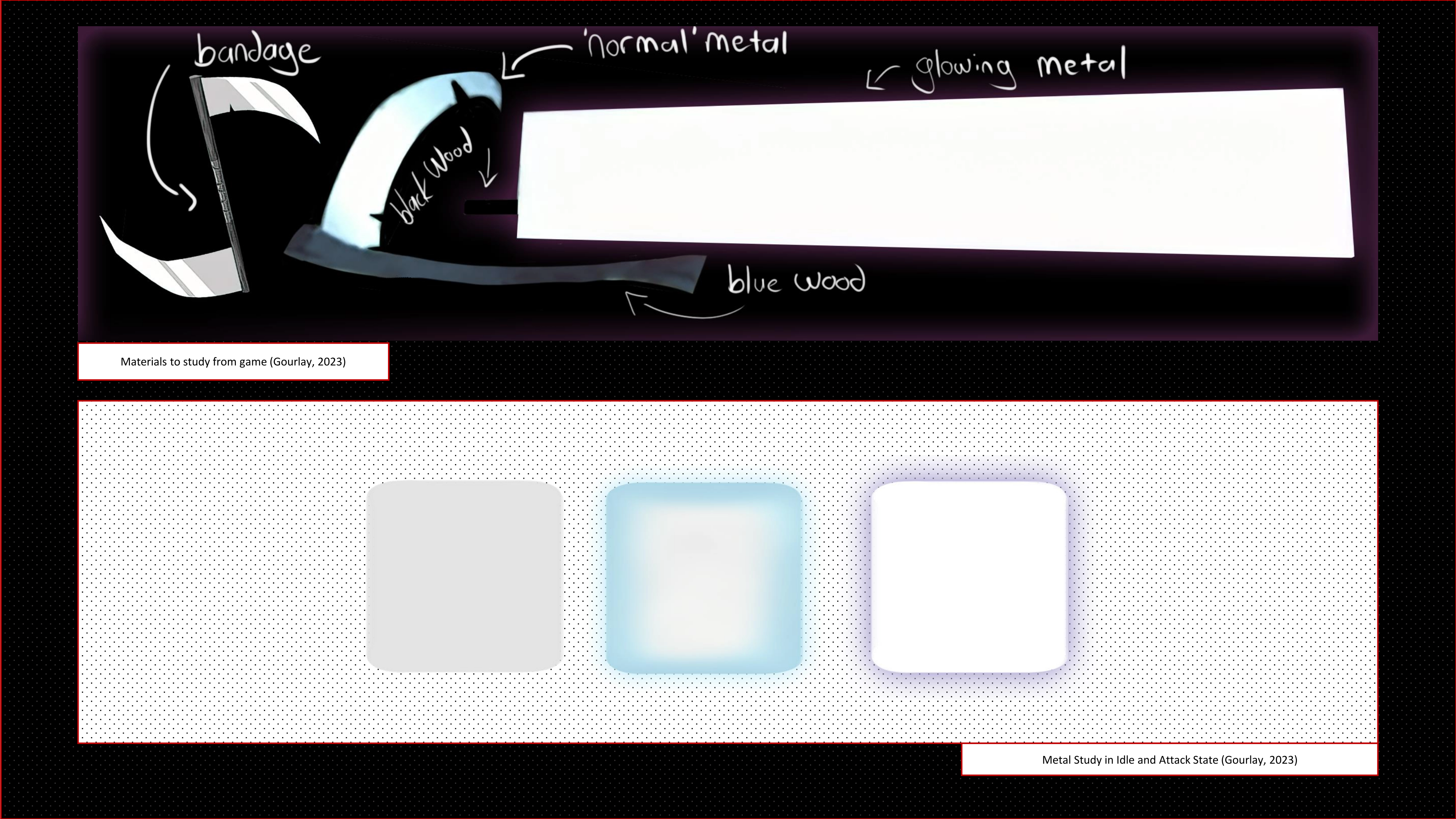
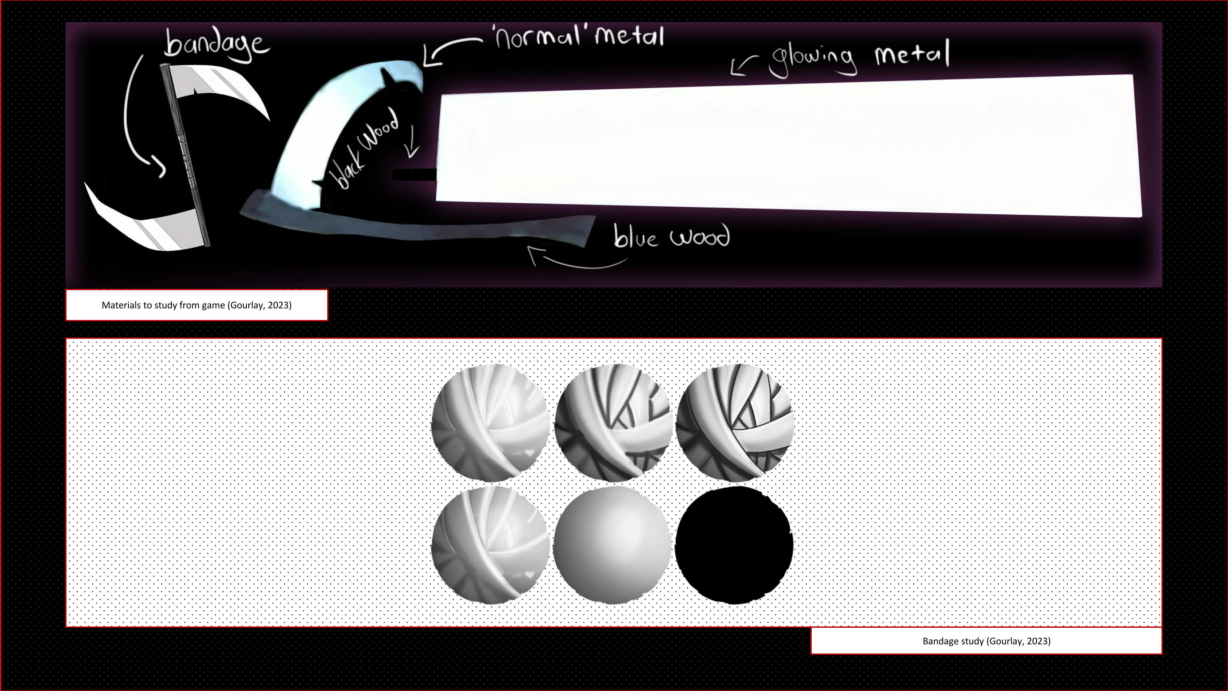
The material for the weapon is simplistic. In its idle state, the blade shines a bright white with a blue shimmer
and slight glow. In the attack mode, the blade glows white and has a purple glow. In its idle state, the wood is a
dark shade of blue without any need for a lot of texturing giving an almost flat 2D appearance if it weren’t for
the shading giving its 3D shape. In the attack mode, the wood darkens to pitch black with a lack of internal
detail. The bandages aren’t visible on any weapons I could find in-game, although featured in the game’s weapon
promotion material. I follow the rules of the other materials by giving a slight 3D appearance without the need of
texturing internal details too much.
.png)
.png)
The aim is to visually represent the orographic view of a sword, showcasing its details, including the hilt, and
blade, in a detailed and comprehensive manner. Now that the design of the weapon was determined, I drew five
orthographic views. The side and front, back, under and above. These views not only make it easier easier for the
perspective drawing, but also help later with the 3D modeling of the weapon if needed.
Although, there are
no intricet details within the blade itself, you are able to see how the design of having edged front and curved
back looks. The front of the blade is sharp while the back becomes thick, and thick enough for the hilt to
connect.
The hilt itself is guardless, but contain bandages wrapped over the wood. It is also cuved, but
not enough to make it look to rounded and keep a sligltly ‘rigid’ design.
When I perfected the orthographic
views, I created a ¾ view to be able to compare the weapon as a 3D object with the game. With many auxiliary lines
and the techniques I had learned, I digitally created a ¾ view. I began with the outline, then gave it It’s base
colour – a muted blue from the standard weapon mode. I then shaded the blade and gave it it’s large white
highlight and removed the outlines. From that I made a render of when it glows in its attack mode, a pure white
blade with a purple glow with a black handle.
After all of this, there is of course another presentaion to make and present.



Projects and work are not only about the product, but also about reflecting on what has been achieved and learned. This self-reflection should help me to learn from good and bad experiences, which will help me with future projects. which will help me with future projects. Basically, however, I am very satisfied with my project work for the first module.
I already have a lot of experience in traditional and digital techniques as I learnt them as I had Art (painting, visual culture studies and art history) as a subject in high school, so a lot of things are a bit easier for me. However, I've only used Photoshop to edit photos, but never really used it as a drawing tool. So, I made sure not to choose a game with a complex 3D design. I used Procreate and Clip Studio Paint a lot before and translated what I knew from there to Photoshop. I learnt a lot in class about many of Photoshop's features and of its possibilities and capabilities. I think that I still need a lot of still need a lot of practice to achieve a smooth workflow, but I am proud to say that I have the many new effects and modes. I had stopped digital drawing for a long time due to a low confidence in my ability, but I feel like I have overcome that hurdle. I now practice on multiple projects.
When it came to rendering the weapon, I felt lacking. The game's art style was to simple. Although I wanted a simple art style at the beginning of the project, I feel a little regret as I could have had an opportunity to do something complex and push my skills further, rather than just using what I know already, for an outcome I knew I could achieve.
I did not have a difficult time with the project. I initially didn't understand what was expected from me at the beginning of the project, but after learning how Canvas works, I was finally able to read what is required of the project.
Although one area I found myself was obsessing if the orographic and 3/4 view were accurate. I saw that the lines made sense, but I made a 3D model just to see if my 3/4 view was correct; It was. Next was obsessing over the design of the document, although it's not graded, I went through about 5 iterations of how the document should be styled. I initially made it quite complex, but then the readability suffered. So instead, I settled on this simple design. I laughed at the fact that choosing how the document should look, took the most time.